Plotting seismograms with increasing epicentral distance using Python (codes included)
Loading likes…
Contents
- Introduction
- Import necessary libraries
- Initialize normalization instance
- Initialize the TauP instance
- What seismograms to plot?
- Plotting the waveforms in the order of increasing distance
- References
Introduction
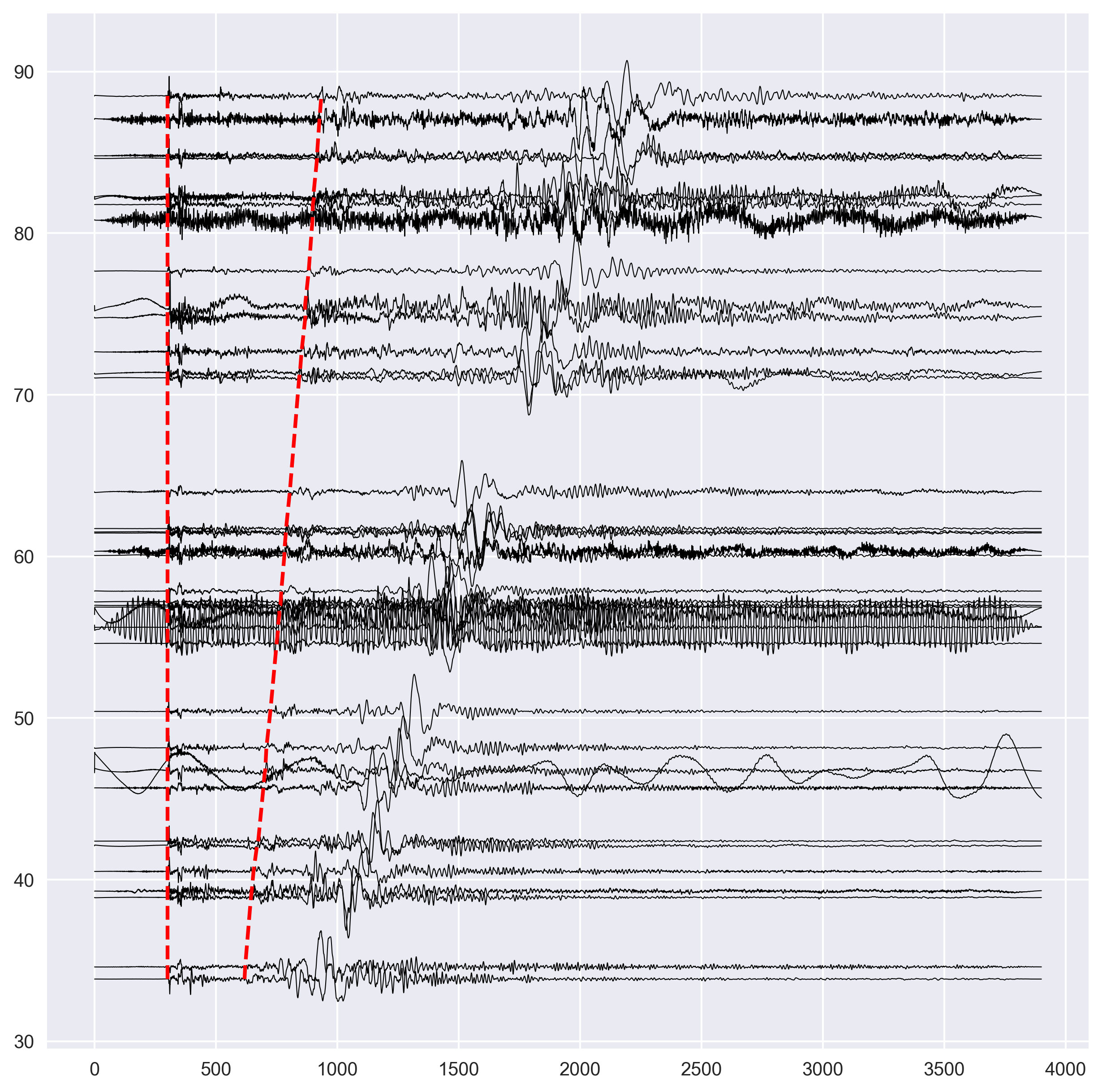
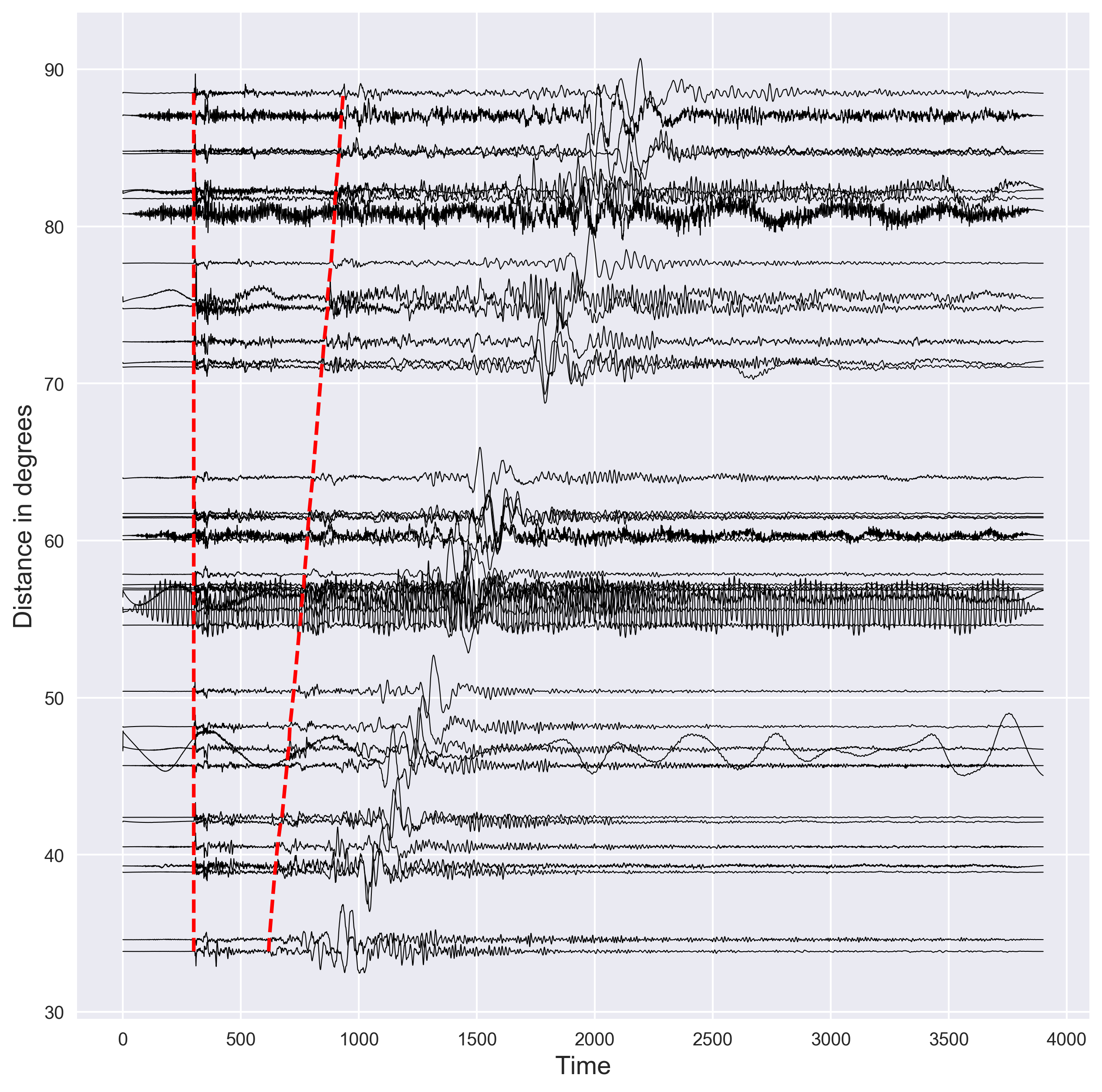
Seismic waves travel from the source to the recording station. In general, the stations close to the source record the seismic waves first and then the station farther than that. This is however not always true as Earth is not homogeneous. The seismic waves propagating deeper layers of earth tends to reach the station faster. This has mainly to do with the increasing velocity structure of Earth (the subsurface structure of Earth is more complicated that that). The first thing seismologists do to understand the seismic structure is to plot the seismic waveforms in order of increasing epicentral distance. Then they plot the arrival time of the P and S-wave (two most common phase present in the seismograms) based on the known earth model. This gives the idea of the arrival time for these phases. Then the observational seismologists pick these phases manually and compare with the arrival time of the known model. This helps in modeling the fine differences in the earth structure from one region to another.
In this post, we will see how we can plot the seismograms with respect to the epicentral distance. The seismograms are read from a directory in the current location of the code. This, however, can be modified.
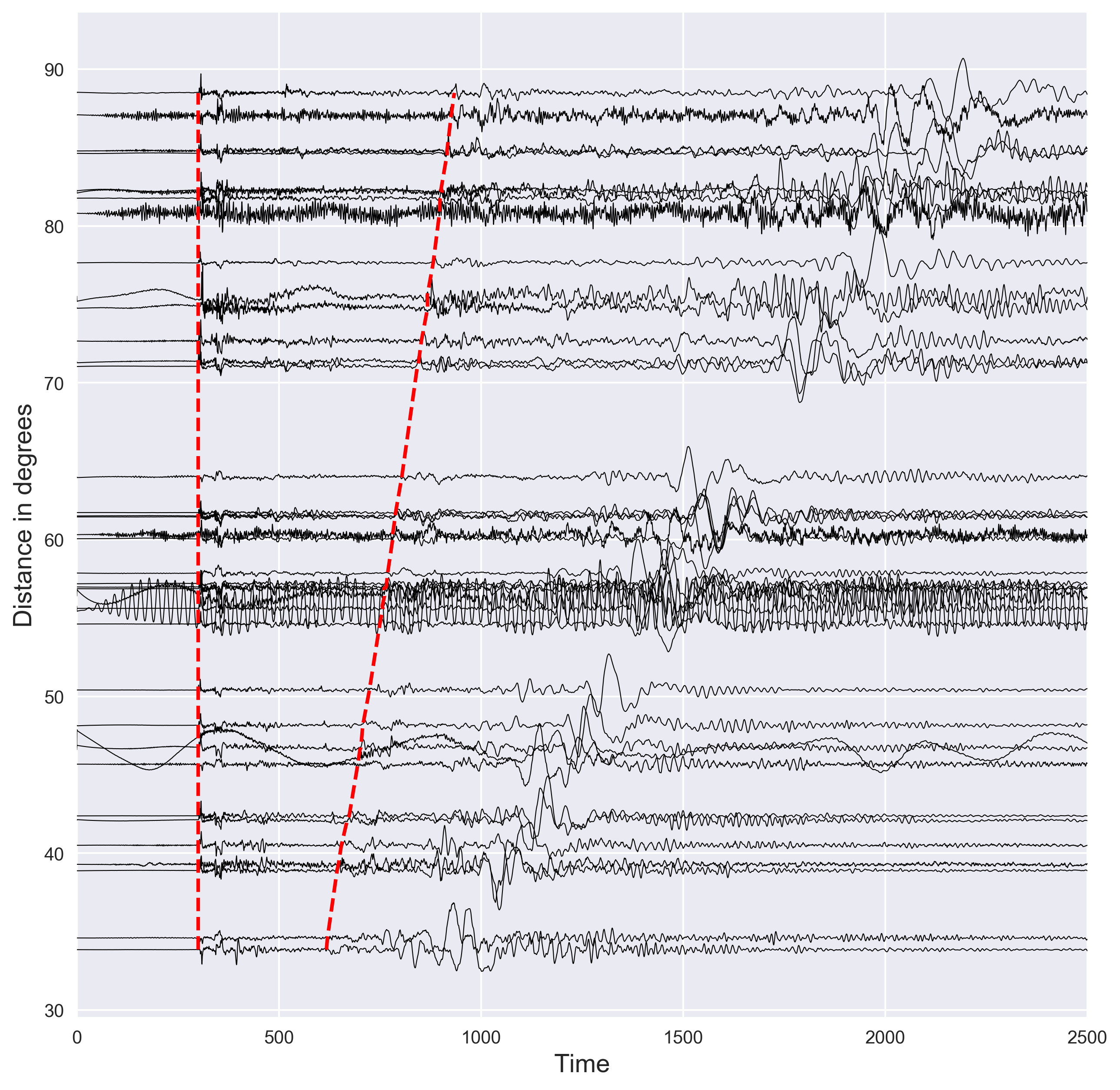
Key idea — a record section turns many seismograms into one picture of Earth structure. Stack the traces vertically, each offset by its epicentral distance, with time on the horizontal axis. Because seismic velocity increases with depth, farther stations record the waves later, so the arrivals trace out sloping moveout curves. Overlay the P and S arrival times predicted by a 1D Earth model (here IASP91, via ObsPy’s TauP): where the picture and the model disagree is exactly where the real Earth departs from the reference — the signal seismologists are after.
Importing Libraries
The first thing I like to do is to import all the necessary libraries for the task. This keeps the code organized.
import matplotlib.pyplot as plt
import numpy as np
from sklearn import preprocessing
import glob
from obspy import read
from obspy.taup import TauPyModel
from obspy.geodetics import kilometers2degrees
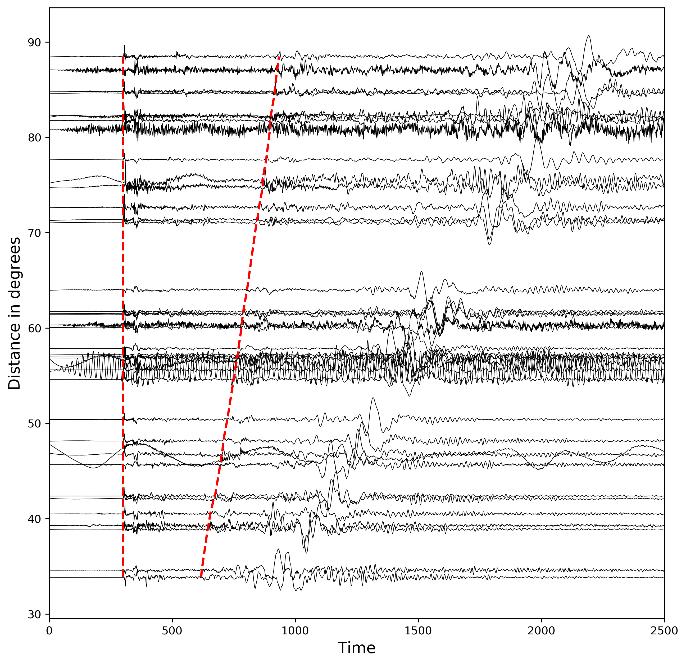
plt.style.use('seaborn-v0_8')
Version note (2026): the bare 'seaborn' style names were deprecated in Matplotlib 3.6 and removed in 3.8. On any current Matplotlib, use the renamed built-ins — 'seaborn-v0_8', 'seaborn-v0_8-darkgrid', etc. (the code above has been updated to 'seaborn-v0_8'). Run plt.style.available to see every style your installation ships.
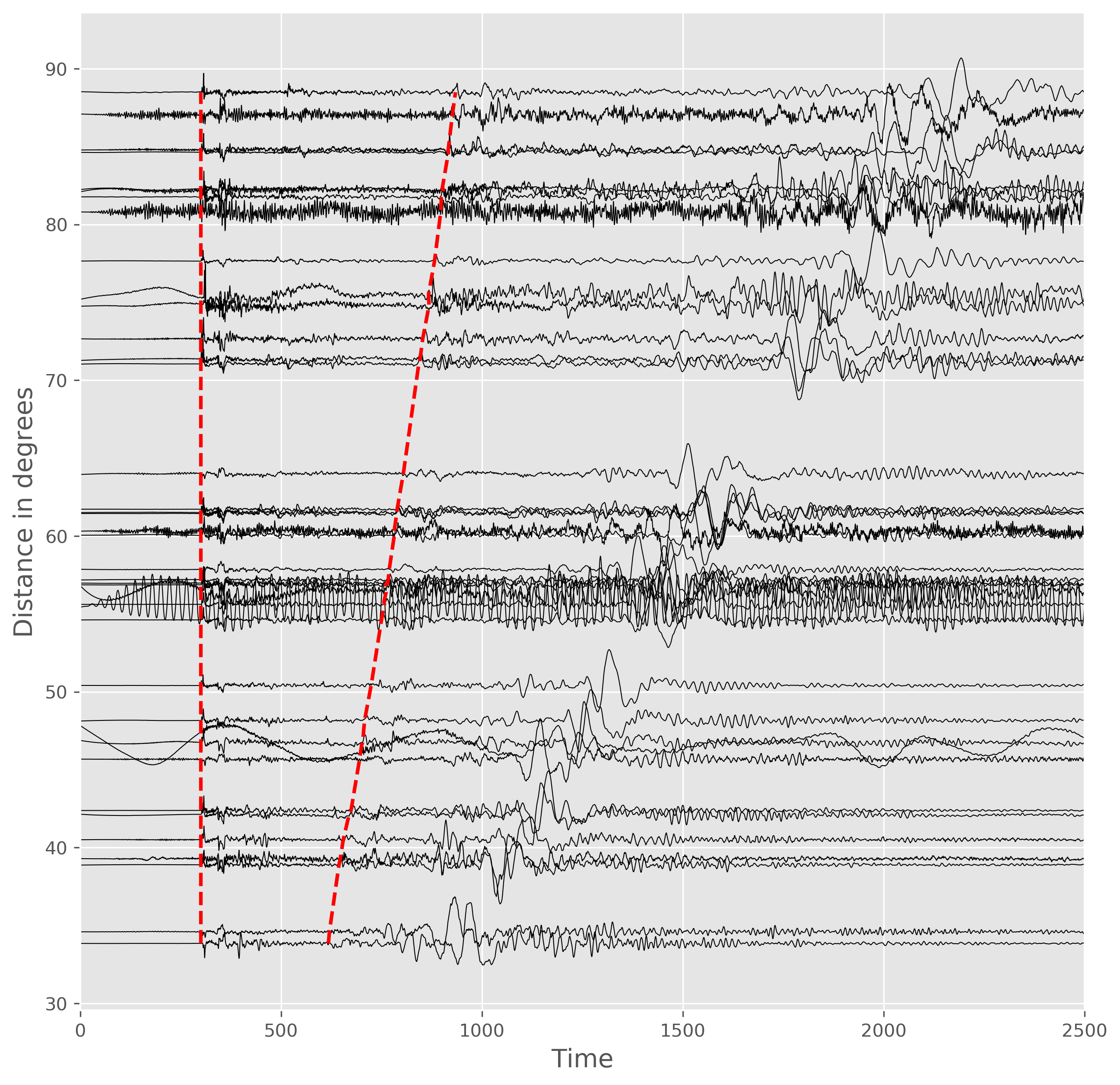
matplotlib.pyplotis imported for the plotting purpose,numpyis for computation,preprocessingfor normalizing the waveforms (there are many other ways to achieve this),readis for reading the seismograms (in this example, we read the sac format but it can be implemented to read many formats). For more details see here.globis for reading the files present in the directoryTauPyModelis for calculating the P and S-wave arrival time for the given Earth model,kilometers2degreesfor converting the km to degrees (as the name suggests)plt.style.use('seaborn-v0_8')is for selecting the style for plotting. There are many other popular styles — I personally likeggplot,seaborn-v0_8,default, andclassic.
Initialize the processing instance for normalizing the waveform fluctuations
## for normalizing traces
min_max_scaler11 = preprocessing.MinMaxScaler(feature_range=(-1, 1))
The above code defines the preprocessing object for normalizing the waveforms in all the seismograms to the same level. We normalize the waveforms from -1 to 1.
Initialize the TauP instance
The TauP is popular tool in seismology for the calculation of travel times and ray paths of seismic phases for a specified 1D spherically symmetric model of the Earth. In this example, we use the TauP module of Obspy.
# tauP earth model setting
model = TauPyModel(model="iasp91")
We select the isap91 model in this example. Some of the other model provided by Obspy are prem, ak135, 1066a, etc (see here for more).
What seismograms to plot?
In this case, I kept all the seismograms in the sac format in the directory, ./dis and ending with the suffix, .DIS.
## read all waveforms in file "disp"
all_disp = glob.glob("dis/*.DIS")
We can print all the files:
['dis/LSA.BHZ.IC.DIS', 'dis/MAJO.BHZ.IU.DIS', 'dis/PET.BHZ.IU.DIS', 'dis/HNR.BHZ.IU.DIS', 'dis/TLY.BHZ.II.DIS', 'dis/CASY.BHZ.IU.DIS', 'dis/NIL.BHZ.II.DIS', 'dis/INCN.BHZ.IU.DIS', 'dis/KMBO.BHZ.IU.DIS', 'dis/TAU.BHZ.II.DIS', 'dis/BJT.BHZ.IC.DIS', 'dis/LSZ.BHZ.IU.DIS', 'dis/MDJ.BHZ.IC.DIS', 'dis/SNZO.BHZ.IU.DIS', 'dis/WAKE.BHZ.IU.DIS', 'dis/AAK.BHZ.II.DIS', 'dis/SPA.BHZ.IU.DIS', 'dis/KIV.BHZ.II.DIS', 'dis/ULN.BHZ.IU.DIS', 'dis/ERM.BHZ.II.DIS', 'dis/ARU.BHZ.II.DIS', 'dis/MAKZ.BHZ.IU.DIS', 'dis/SSE.BHZ.IC.DIS', 'dis/XAN.BHZ.IC.DIS', 'dis/KMI.BHZ.IC.DIS', 'dis/SUR.BHZ.II.DIS', 'dis/WMQ.BHZ.IC.DIS', 'dis/YAK.BHZ.IU.DIS', 'dis/BILL.BHZ.IU.DIS', 'dis/OBN.BHZ.II.DIS', 'dis/ADK.BHZ.IU.DIS', 'dis/MSEY.BHZ.II.DIS', 'dis/GUMO.BHZ.IU.DIS', 'dis/CTAO.BHZ.IU.DIS', 'dis/YSS.BHZ.IU.DIS', 'dis/BRVK.BHZ.II.DIS', 'dis/JOHN.BHZ.IU.DIS', 'dis/HIA.BHZ.IC.DIS', 'dis/FURI.BHZ.IU.DIS', 'dis/ENH.BHZ.IC.DIS']
glob outputs the available files as a list. The data in this case has been obtained from IRIS (now part of EarthScope, following the 2023 merger of IRIS and UNAVCO) with the setting of 5 minutes after the P-arrival.
Now, we intantiate a figure instance and then iterate through each seismogram to plot.
Plotting the waveforms in the order of increasing distance
Now, we do the following steps in order:
- iterate through each of the sac file,
- read the seismogram,
- extract the time and data axis for each seismogram,
- extract the epicentral distance in km and convert to degrees
- calculate the P and S wave arrival times for the given source depth and epicentral distance. Note that we have already specified the earth model in the previous section.
- save P and S arrival time as separate variables
- normalize the seismogram data from -1 to 1 using the instance defined in the previous section.
- plot the normalized data with a shift of epicentral distance. The x-axis in all cases are same. We plot the waveforms with black color and set the linewidth of 0.5 to clearly see the fluctuations. We multiply the amplitude of each seismogram with two to increase visibility.
- Since the data is aligned with respect to the P-arrival time, the P-arrival is same in each case.
- we store the P-arrival time, calculated S-arrival time, and S-arrival marking location for each seismogram.
## visualizing
fig,ax = plt.subplots(1,1,figsize=(10,10))

p_arrival_times,s_arrival_times,s_arrival_dist = [], [], []
## loop through all files
for disp in all_disp:
    # read file
    st =  read(disp)
    dist = kilometers2degrees(st[0].stats.sac['dist']) #convert from km to degree
    time_axis = st[0].times()
    data_axis = st[0].data
    evdp = st[0].stats.sac['evdp'] #event depth
    arrivals = model.get_travel_times(source_depth_in_km=evdp, distance_in_degree=dist, phase_list=["P","S"]) #get P and S wave arrival time using tauP
    p_arrival = arrivals[0].time
    s_arrival = arrivals[1].time
    data_axis = min_max_scaler11.fit_transform((data_axis).reshape(-1, 1)) #normalize traces
    ax.plot(time_axis,2*data_axis+dist,color='k',lw=0.5)
    p_arrival_times.append(5*60)
    s_arrival_times.append(5*60+(s_arrival-p_arrival))
    s_arrival_dist.append(2*np.mean(data_axis)+dist)
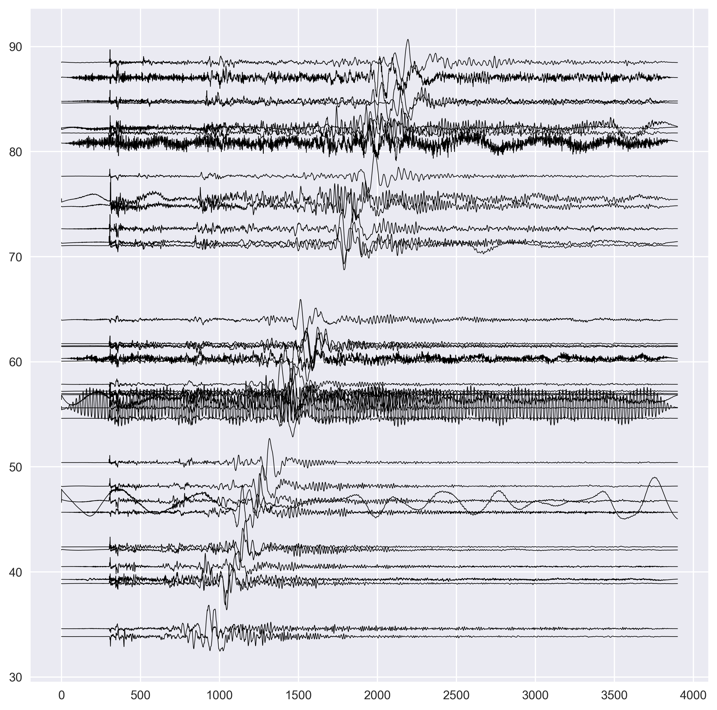
- we convert each lists into the numpy array. We used the list to append the data because it is relatively faster and efficient. Numpy array is optimized for computation, which is difficult using the Python’s list data type.
- we sort the S-wave arrival x and y locations for each seismograms in order of increasing distance. We also sort the P and S-wave arrival times.
- Now, we plot the P and S arrival times using the dashed line of red color. We made the thickness higher in this case.
s_arrival_dist = np.array(s_arrival_dist)
s_arrival_times = np.array(s_arrival_times)
p_arrival_times = np.array(p_arrival_times)

s_arrival_sort_idx = np.argsort(s_arrival_dist)
s_arrival_dist = s_arrival_dist[s_arrival_sort_idx]
s_arrival_times = s_arrival_times[s_arrival_sort_idx]
p_arrival_times = p_arrival_times[s_arrival_sort_idx]

ax.plot(s_arrival_times,s_arrival_dist,'r--',lw=2) #plot S arrivals
ax.plot(p_arrival_times,s_arrival_dist,'r--',lw=2) #plot P arrivals
- We label the x and y axis.
ax.set_ylabel('Distance in degrees',fontsize=14)
ax.set_xlabel('Time',fontsize=14)
- We only display the plot for the time axis from 0 to 2500 seconds.
- Finally, we save the figure in the
pngformat, crop it to remove the white spaces and set the resolution of 300 dpi.
ax.set_xlim([0,2500])
plt.savefig("dist-waveforms.png",bbox_inches='tight',dpi=300)
Quick check: In the record section, why do the P and S arrival marks form two separate sloping curves that spread apart as distance increases?
- Because the seismograms are sorted alphabetically by station name
- Because S waves travel slower than P waves, so the P–S time gap grows the farther the wave has to travel
- Because the normalization multiplies each trace by its distance
- Because IASP91 uses a different origin time for P and S
References
Crotwell, H. P., Owens, T. J., & Ritsema, J. (1999). The TauP Toolkit: Flexible seismic travel-time and ray-path utilities. Seismological Research Letters, 70(2), 154–160. https://doi.org/10.1785/gssrl.70.2.154
Resources
Recap
- A record section stacks seismograms with time on the x-axis and each trace offset by its epicentral distance — the standard first look at an earthquake’s wavefield.
- Read each SAC trace with
obspy.read, pull the epicentral distance from the SAC header, and convert km → degrees withobspy.geodetics.kilometers2degrees. - Predict P and S arrival times for a 1D Earth model with
obspy.taup.TauPyModel(iasp91,prem,ak135, …) and itsget_travel_times(source_depth_in_km, distance_in_degree, phase_list). - Normalize each trace to a common amplitude (here
sklearn’sMinMaxScalerto [−1, 1]) so a strong nearby record doesn’t dwarf the distant ones. - Because velocity increases with depth, farther stations arrive later and the P–S gap widens — mismatches with the model curve are where the real Earth structure lives.
Where to go next
- Getting started with ObsPy — Part I — downloading waveform data, the fundamentals behind the SAC files read here.
- Plotting the great-circle path with PyGMT — visualize the source–receiver geometry behind these epicentral distances.
- ObsPy TauP documentation — every phase name and Earth model available for travel-time calculation.
This post was last modified at 2026-10-21 00:39.
Found this article useful?
Loading likes…
Disclaimer of liability
The information provided by the Earth Inversion is made available for educational purposes only.
Whilst we endeavor to keep the information up-to-date and correct. Earth Inversion makes no representations or warranties of any kind, express or implied about the completeness, accuracy, reliability, suitability or availability with respect to the website or the information, products, services or related graphics content on the website for any purpose.
UNDER NO CIRCUMSTANCE SHALL WE HAVE ANY LIABILITY TO YOU FOR ANY LOSS OR DAMAGE OF ANY KIND INCURRED AS A RESULT OF THE USE OF THE SITE OR RELIANCE ON ANY INFORMATION PROVIDED ON THE SITE. ANY RELIANCE YOU PLACED ON SUCH MATERIAL IS THEREFORE STRICTLY AT YOUR OWN RISK.
Leave a comment