Plotting the geospatial data clipped by coastlines in Python (codes included)
Introduction
In geosciences, we most frequently have to make geospatial plots, but the available data is unevenly distributed and irregular (Figure 1). We like to show the data, in general, for the whole region and one way of performing, so it to do the geospatial interpolation of the data. Geospatial interpolation means merely that we obtain the interpolated values of the data at regular grid points, both longitudinally and latitudinally. After obtaining these values, if we plot the data, then the grid points is most likely to extend out of the coastline constrain of our study. We wish to plot the data inside the coastline borders of the area, which is our area of study. We can do that by just removing all the grid points outside the perimeter. One way to clip the data outside the coastline path is to remove the grid points outside the region manually, but this method is quite tedious. We, programmers, love being lazy, and that helps us to seek better ways.
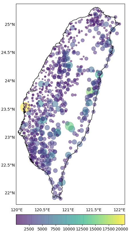
In this post, we aim to do
- The interpolation of these data values using the ordinary kriging method and
- plot the output within the coastline border of Taiwan.
If you want to inspect the spatial and temporal pattern in the geospatial data, you can consider doing the Empirical Orthogonal Function Analysis. It helps us to get rid of the noise and shows the most dominant pattern in the data.
Key idea — interpolate first, then clip. Field measurements come from scattered, irregular stations, but you want a map for the whole region. Two steps get you there: (1) ordinary kriging (PyKrige) estimates the value at every point of a regular grid, using the data’s own spatial correlation (a variogram) to weight nearby stations — turning dots into a smooth surface; (2) a matplotlib PathPatch built from the coastline polygons masks everything outside the study area, so the interpolated field shows only where it’s meaningful (inland Taiwan here).
Basemap is end-of-life (2026 update). mpl_toolkits.basemap had its final release in 2020 and is unmaintained — use Cartopy or PyGMT for new work. The kriging and PathPatch-clipping ideas here carry over unchanged; only the map-drawing calls differ.
For implementing the ordinary kriging interpolation, we will use the “pykrige” kriging toolkit available for Python. The package can be easily installed using the “pip” or “conda” package manager for Python.
PyKrige today. PyKrige is actively maintained by the GeoStat-Framework (latest release 1.7.3 as of 2026). Install with pip install pykrige or conda install -c conda-forge pykrige; the OrdinaryKriging class and write_asc_grid helper used below are still current.
Importing necessary modules
import numpy as np
import pandas as pd
import glob
from pykrige.ok import OrdinaryKriging
from pykrige.kriging_tools import write_asc_grid
import pykrige.kriging_tools as kt
import matplotlib.pyplot as plt
from mpl_toolkits.basemap import Basemap
from matplotlib.colors import LinearSegmentedColormap
from matplotlib.patches import Path, PathPatch
Reading data
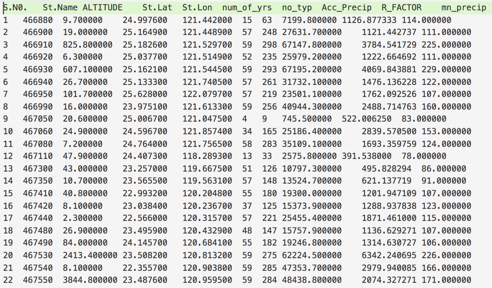
The first step for interpolation is to read the available data. Our data is of the format shown in Figure 2. Let’s say we want to interpolate for the “R_FACTOR”. We first read this data file. We can easily do that using the “pandas” in Python.
datafile='datafilename.txt'
df=pd.read_csv(datafile,delimiter='s+')
Now, we have read the whole tabular data, but we need only the “R_FACTOR”, “St.Lat”, and “St.Lon” columns.
lons=np.array(df['St.Lon'])
lats=np.array(df['St.Lat'])
data=np.array(df[data])
Kriging data
Now, we have our required data available in the three variables. We can, now, define the grid points where we seek the interpolated values.
grid_space = 0.01
grid_lon = np.arange(np.amin(lons), np.amax(lons), grid_space) #grid_space is the desired delta/step of the output array
grid_lat = np.arange(np.amin(lats), np.amax(lats), grid_space)
The minimum and maximum of the longitude and latitude are chosen based on the data.
We use the “ordinary kriging” function of “pykrige” package to interpolate our data at the defined grid points. For more details, the user can refer to the documentation of the “pykrige” package.
OK = OrdinaryKriging(lons, lats, data, variogram_model='gaussian', verbose=True, enable_plotting=False,nlags=20)
z1, ss1 = OK.execute('grid', grid_lon, grid_lat)
“z1” is the interpolated values of “R_FACTOR” at the grid_lon and grid_lat values.
Plotting interpolation
Now, we wish to plot the interpolated values. We will use the “basemap” module to plot the geographic data.
xintrp, yintrp = np.meshgrid(grid_lon, grid_lat)
fig, ax = plt.subplots(figsize=(10,10))
m = Basemap(llcrnrlon=lons.min()-0.1,llcrnrlat=lats.min()-0.1,urcrnrlon=lons.max()+0.1,urcrnrlat=lats.max()+0.1, projection='merc', resolution='h',area_thresh=1000.,ax=ax)
We, first, made the 2D meshgrid using the grid points and then call the basemap object “m” with the Mercator projection. The constraints of the basemap object can be manually defined instead of the minimum and maximum of the latitude and longitude values as used.
m.drawcoastlines() #draw coastlines on the map
x,y=m(xintrp, yintrp) # convert the coordinates into the map scales
ln,lt=m(lons,lats)
cs=ax.contourf(x, y, z1, np.linspace(0, 4500, ncols),extend='both',cmap='jet') #plot the data on the map.
cbar=m.colorbar(cs,location='right',pad="7%") #plot the colorbar on the map
# draw parallels.
parallels = np.arange(21.5,26.0,0.5)
m.drawparallels(parallels,labels=[1,0,0,0],fontsize=14, linewidth=0.0) #Draw the latitude labels on the map

# draw meridians
meridians = np.arange(119.5,122.5,0.5)
m.drawmeridians(meridians,labels=[0,0,0,1],fontsize=14, linewidth=0.0)
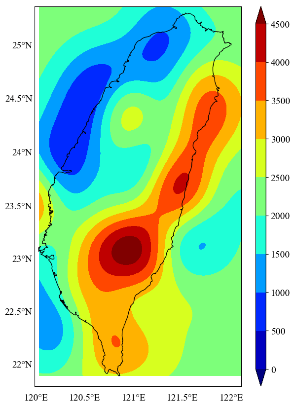
This will give us the plot of the interpolated values (Figure 3). Here, we do not seek the plot outside the coastline boundary of Taiwan. We wish to mask the data outside the boundary.
Masking unnecessary parts in the map
##getting the limits of the map:
x0,x1 = ax.get_xlim()
y0,y1 = ax.get_ylim()
map_edges = np.array([[x0,y0],[x1,y0],[x1,y1],[x0,y1]])
##getting all polygons used to draw the coastlines of the map
polys = [p.boundary for p in m.landpolygons]

##combining with map edges
polys = [map_edges]+polys[:]
##creating a PathPatch
codes = [
[Path.MOVETO]+[Path.LINETO for p in p[1:]]
for p in polys
]

polys_lin = [v for p in polys for v in p]

codes_lin = [xx for cs in codes for xx in cs]

path = Path(polys_lin, codes_lin)
patch = PathPatch(path,facecolor='white', lw=0)
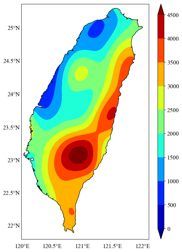
Here, the ‘facecolor’ of the ‘pathpatch’ defines the color of the masking. We kept is ‘white,’ but the user can define any color they like.
##masking the data outside the inland of Taiwan
ax.add_patch(patch)
plt.show() #to display the plot
# plt.savefig('figurename.png',dpi=300,bbox_inches='tight') #to save the figure in png format
plt.close('all')
Quick check: What does ordinary kriging actually do in step 1?
- It draws the coastline of Taiwan from a shapefile
- It estimates the value on a regular grid from the scattered station values, weighting neighbours by their spatial correlation (a variogram)
- It deletes the grid points that fall in the sea
- It converts latitude/longitude into Mercator map coordinates
Conclusions
In this post, I have shown how one can interpolate geospatial data with the kriging. Then I also showed how to plot the interpolation results on a map and then clip the results outlside the coastlines. I have also made other posts for clipping the data (topographic) on the coastlines in a similar way.
Recap
- Scattered → smooth:
OrdinaryKriging(lons, lats, data, variogram_model='gaussian', ...)thenOK.execute('grid', grid_lon, grid_lat)interpolates the station values onto a regular grid. - Plot the grid with Basemap’s
contourf; the interpolation naturally spills past the coastline (Figure 3). - Clip it by building a
PathPatchfromm.landpolygons(+ the map edges) and adding it on top — masking everything outside the study area (Figure 4). - The choice of
variogram_model(gaussian, spherical, exponential…) andnlagscontrols how the surface is interpolated. - Basemap is EOL — the same krige-then-clip recipe ports to Cartopy/PyGMT.
Where to go next
- Topographic map clipped by coastlines — the same
PathPatchmask applied to a relief raster instead of interpolated data. - Empirical Orthogonal Function analysis of geospatial data — find the dominant spatial patterns once your field is gridded.
- Get started with pandas for Earth-data analysis — reading the station table this post interpolates.
This post was last modified at 2026-10-14 04:00.
Disclaimer of liability
The information provided by the Earth Inversion is made available for educational purposes only.
Whilst we endeavor to keep the information up-to-date and correct. Earth Inversion makes no representations or warranties of any kind, express or implied about the completeness, accuracy, reliability, suitability or availability with respect to the website or the information, products, services or related graphics content on the website for any purpose.
UNDER NO CIRCUMSTANCE SHALL WE HAVE ANY LIABILITY TO YOU FOR ANY LOSS OR DAMAGE OF ANY KIND INCURRED AS A RESULT OF THE USE OF THE SITE OR RELIANCE ON ANY INFORMATION PROVIDED ON THE SITE. ANY RELIANCE YOU PLACED ON SUCH MATERIAL IS THEREFORE STRICTLY AT YOUR OWN RISK.
Leave a comment