Introduction
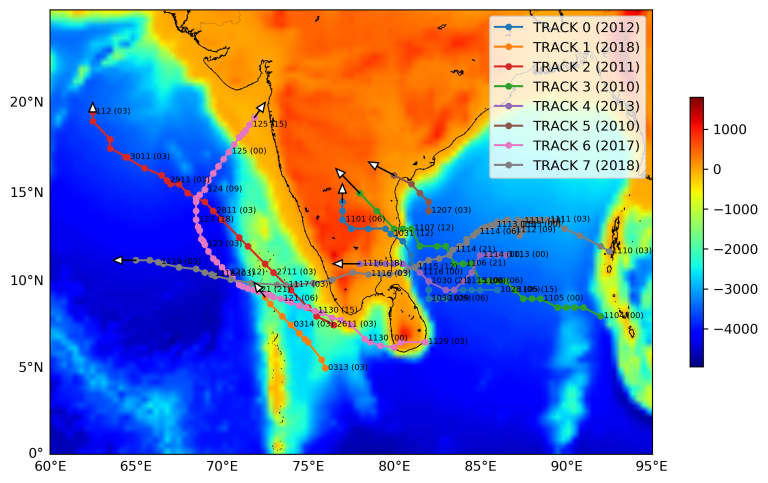
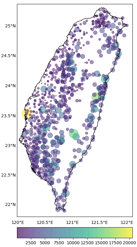
In geosciences, it’s common to work with geospatial data that is often unevenly distributed and irregularly spaced (Figure 1). When visualizing such data, especially for a specific region, geospatial interpolation becomes essential. This process involves estimating data values at regular grid points based on available irregularly spaced data, both longitudinally and latitudinally.
After interpolation, the grid may extend beyond the geographic boundaries of the area of interest, such as coastlines. To focus on the region of study, it’s necessary to clip the data to fit within these natural boundaries. Manually removing data points outside the coastline can be time-consuming, but as programmers, we favor automated and efficient solutions.
In this post, we’ll explore:
- Interpolating the geospatial data using the Ordinary Kriging method.
- Plotting the interpolation results within the coastline borders of Taiwan.
For those interested in analyzing spatial and temporal patterns in geospatial data, consider using Empirical Orthogonal Function Analysis, which helps filter out noise and highlights dominant patterns in the data.
To perform Ordinary Kriging interpolation, we’ll use the “pykrige” library available in Python, which can be easily installed via “pip” or “conda.”
Steps to Perform Kriging
Importing Necessary Modules
import numpy as np
import pandas as pd
from pykrige.ok import OrdinaryKriging
from pykrige.kriging_tools import write_asc_grid
import matplotlib.pyplot as plt
from mpl_toolkits.basemap import Basemap
from matplotlib.colors import LinearSegmentedColormap
from matplotlib.patches import Path, PathPatch
Reading the Data
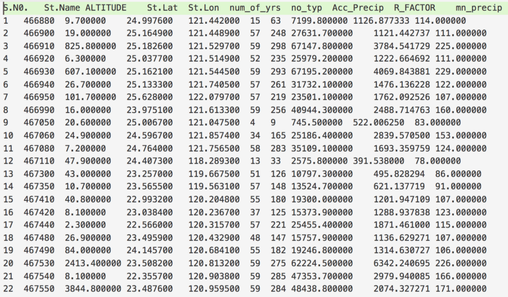
The first step in interpolation is to read the available data. The data format is shown in Figure 2. Suppose we want to interpolate the “R_FACTOR” column. We can read the data file using the pandas library in Python.
datafile = 'datafilename.txt'
df = pd.read_csv(datafile, delimiter='s+')
After reading the data, we extract only the necessary columns: “R_FACTOR”, “St.Lat”, and “St.Lon”.
lons = np.array(df['St.Lon'])
lats = np.array(df['St.Lat'])
data = np.array(df['R_FACTOR'])
Performing Kriging Interpolation
With the required data now available in our variables, we can define the grid points for interpolation.
grid_space = 0.01
grid_lon = np.arange(np.amin(lons), np.amax(lons), grid_space)
grid_lat = np.arange(np.amin(lats), np.amax(lats), grid_space)
The grid is defined by the minimum and maximum longitude and latitude values of the data. We then use the Ordinary Kriging function from the “pykrige” package to interpolate the data.
OK = OrdinaryKriging(lons, lats, data, variogram_model='gaussian', verbose=True, enable_plotting=False, nlags=20)
z1, ss1 = OK.execute('grid', grid_lon, grid_lat)
Here, z1 contains the interpolated values of “R_FACTOR” at the grid points defined by grid_lon and grid_lat.
Plotting the Interpolated Data
Next, we plot the interpolated values using the basemap module to visualize the geographic data.
xintrp, yintrp = np.meshgrid(grid_lon, grid_lat)
fig, ax = plt.subplots(figsize=(10, 10))
m = Basemap(llcrnrlon=lons.min()-0.1, llcrnrlat=lats.min()-0.1, urcrnrlon=lons.max()+0.1, urcrnrlat=lats.max()+0.1, projection='merc', resolution='h', area_thresh=1000., ax=ax)
Here, we create a 2D meshgrid of the grid points and then initialize the basemap with the Mercator projection. The map constraints can be manually adjusted if desired.
m.drawcoastlines()
x, y = m(xintrp, yintrp)
ln, lt = m(lons, lats)
cs = ax.contourf(x, y, z1, np.linspace(0, 4500, len(grid_lon)), extend='both', cmap='jet')
cbar = m.colorbar(cs, location='right', pad="7%")
parallels = np.arange(21.5, 26.0, 0.5)
m.drawparallels(parallels, labels=[1,0,0,0], fontsize=14, linewidth=0.0)
meridians = np.arange(119.5, 122.5, 0.5)
m.drawmeridians(meridians, labels=[0,0,0,1], fontsize=14, linewidth=0.0)
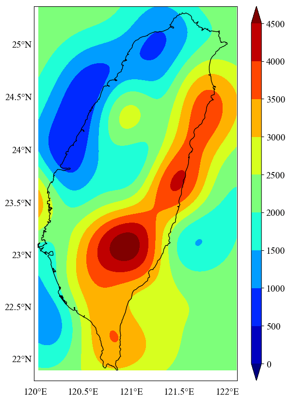
This code generates a plot of the interpolated values (Figure 3). However, we still need to mask the areas outside the coastline boundary.
Masking Unnecessary Areas on the Map
To mask data outside the coastline:
x0, x1 = ax.get_xlim()
y0, y1 = ax.get_ylim()
map_edges = np.array([[x0, y0], [x1, y0], [x1, y1], [x0, y1]])
polys = [p.boundary for p in m.landpolygons]
polys = [map_edges] + polys
codes = [[Path.MOVETO] + [Path.LINETO for _ in p[1:]] for p in polys]
polys_lin = [v for p in polys for v in p]
codes_lin = [code for cs in codes for code in cs]
path = Path(polys_lin, codes_lin)
patch = PathPatch(path, facecolor='white', lw=0)
The facecolor parameter defines the mask color, which we’ve set to white, but you can choose any color.
ax.add_patch(patch)
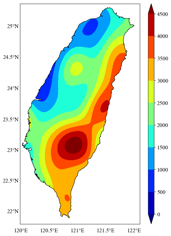
plt.show()  # To display the plot
# plt.savefig('figurename.png', dpi=300, bbox_inches='tight')  # To save the figure as a PNG file
plt.close('all')
Conclusions
In this post, we’ve demonstrated how to perform geospatial interpolation using the kriging method and how to visualize the results on a map while clipping data outside the coastline boundaries. For further exploration, you can refer to our post on clipping topographic data to coastlines, which uses a similar approach.

