How to plot the earthquakes data on a topographic map
Loading likes…
In this post, we will first read a CSV file with earthquake locations (latitudes, and longitudes), magnitudes, and depths, and then overlay it on a topographic map. The topographic data are downloaded automatically using PyGMT API.
Key idea — one dot can carry three variables at once. A good earthquake map isn’t just where events happened. In PyGMT you build it in layers — a topographic background (grdimage), coastlines (coast), then the events (plot) — and each event circle encodes three things simultaneously: its position (longitude, latitude), its size (scaled by magnitude), and its fill colour (mapped from depth through a colormap). Read those three channels together and a single figure tells you the whole story.
Read the csv file for events data
I have a csv file containing the earthquake events data. The data is obtained from the PyGMT example dataset. It can be obtained and saved locally:
data = pygmt.datasets.load_japan_quakes()
data.to_csv('my_events_data.csv', index=False)
The data is tabular, so we can read it using the pandas’ read_csv method.
import pandas as pd

# this file is retrieved from the pygmt dataset
data = pd.read_csv('my_events_data.csv')

Plot the data on a topographic map
First, we define the region based on the data.
# Set the region
region = [
    data.longitude.min() - 1,
    data.longitude.max() + 1,
    data.latitude.min() - 1,
    data.latitude.max() + 1,
]
Then we initialize the pygmt “Figure” object:
fig = pygmt.Figure()
Next, we obtain the high-resolution topographic data and plot it using the normalized etopo1 colormap. We set the minimum elevation of -8000 m and a maximum of 5000 m. If there are any topographic regions outside this range then it will be plotted with white. We select the “Mercator” projection with a width of 4 inches for plotting.
# make color pallets
pygmt.makecpt(
    cmap='etopo1',
    series='-8000/5000/1000', #min elevation of -8000m and max of 5000m
    continuous=True
)

# define etopo data file
topo_data = "@earth_relief_30s"
# plot high res topography
fig.grdimage(
    grid=topo_data,
    region=region,
    projection='M4i',
    shading=True,
    frame=True
)
We next plot the coastlines with shorelines, and also added a frame to the map.
fig.coast(shorelines=True, frame=True)
Finally, we plot the data:
# colorbar colormap
pygmt.makecpt(cmap="jet", series=[
              data.depth_km.min(), data.depth_km.max()])
fig.plot(
    x=data.longitude,
    y=data.latitude,
    sizes=0.1*data.magnitude,
    color=data.depth_km,
    cmap=True,
    style="cc",
    pen="black",
)
fig.colorbar(frame='af+l"Depth (km)"')
fig.savefig('my_earthquakes.png')
We plot the data with color representing the depths of the earthquakes and the size of the circles representing the magnitudes of the earthquakes. We added the horizontal color bar at the bottom.
Two PyGMT arguments were renamed after this post. In the fig.plot(...) call above, current PyGMT uses size= (not sizes=) for per-point sizes, and fill= (not color=) for the colour mapped through the colormap. Both old names were deprecated (around v0.8) and later removed. On a current PyGMT, the call becomes fig.plot(x=..., y=..., size=0.1*data.magnitude, fill=data.depth_km, cmap=True, style="cc", pen="black"). The @earth_relief_30s remote grid and everything else are unchanged.
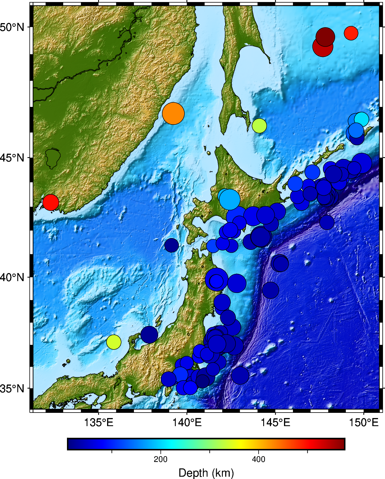
Quick check: In this figure, what does the colour of each earthquake circle represent?
Complete script
Recap
- Build the map in layers.
grdimage(topography) →coast(shorelines) →plot(events) →colorbar, all sharing the sameregion. - Encode three variables per symbol. Position = lon/lat,
size∝ magnitude,fill(viamakecpt) = depth — one glance conveys where, how big, how deep. - Two colormaps, two jobs.
etopo1colours the topography; a separatejetcpt colours the earthquakes by depth. - Mind the renamed args. Modern PyGMT wants
size=andfill=(notsizes=/color=).
Where to go next
- 3-D version of this map: Plot earthquakes on a three-dimensional topographic map
- PyGMT
fig.plotdocs (size,fill): pygmt.org/latest/api/generated/pygmt.Figure.plot.html - PyGMT
makecptdocs: pygmt.org/latest/api/generated/pygmt.makecpt.html
Found this article useful?
Loading likes…
Disclaimer of liability
The information provided by the Earth Inversion is made available for educational purposes only.
Whilst we endeavor to keep the information up-to-date and correct. Earth Inversion makes no representations or warranties of any kind, express or implied about the completeness, accuracy, reliability, suitability or availability with respect to the website or the information, products, services or related graphics content on the website for any purpose.
UNDER NO CIRCUMSTANCE SHALL WE HAVE ANY LIABILITY TO YOU FOR ANY LOSS OR DAMAGE OF ANY KIND INCURRED AS A RESULT OF THE USE OF THE SITE OR RELIANCE ON ANY INFORMATION PROVIDED ON THE SITE. ANY RELIANCE YOU PLACED ON SUCH MATERIAL IS THEREFORE STRICTLY AT YOUR OWN RISK.
Leave a comment