Introduction
If you have been working in seismology, then you must have come across Generic Mapping Tools (GMT) software. It is widely used software, not only in seismology but across the Earth, Ocean, and Planetary sciences and beyond. It is a free, open-source software used to generate publication quality maps or illustrations, process data and make animations. Recently, GMT built API (Application Programming Interface) for MATLAB, Julia and Python. In this post, we will explore the Python wrapper library for the GMP API – PyGMT. Using the GMT from Python script allows enormous capabilities.
The API reference for PyGMT can be accessed from here and is strongly recommended. Although PyGMT project is still in completion, there are many functionalities available.
Step-by-step guide for PyGMT using an example
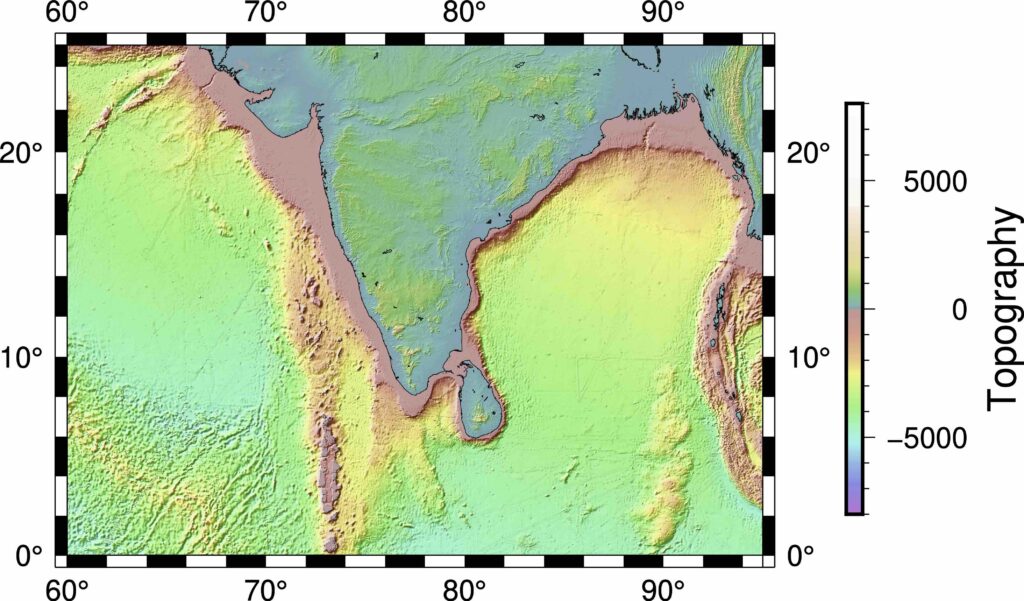
In this post, we will demonstrate the PyGMT implementation by plotting the topographic map of southern India. We will also plot some markers on the map.
Importing Libraries
The first thing I like to do is to import all the necessary libraries for the task. This keeps the code organized.
import pygmt
minlon, maxlon = 60, 95
minlat, maxlat = 0, 25
Define topographic data source
The topographic data can be accessed from various sources. In this snippet below, I listed a couple of sources.
#define etopo data file
# topo_data = 'path_to_local_data_file'
topo_data = '@earth_relief_30s' #30 arc second global relief (SRTM15+V2.1 @ 1.0 km)
# topo_data = '@earth_relief_15s' #15 arc second global relief (SRTM15+V2.1)
# topo_data = '@earth_relief_03s' #3 arc second global relief (SRTM3S)
Initialize the pyGMT figure
Similar to the matplotlib’s fig = plt.Figure(), PyGMT begins with the creation of Figure instance.
# Visualization
fig = pygmt.Figure()
Define CPT file
# make color pallets
pygmt.makecpt(
    cmap='topo',
    series='-8000/8000/1000',
    continuous=True
)
Plot the high resolution topography from the data source
Now, we provide the topo_data, region and the projection for the figure to plot. The region can also be provided in the form of ISO country code strings, e.g. TW for Taiwan, IN for India, etc. For more ISO codes, check the wikipedia page here. In this example, we used the projection of M4i, which specifies four-inch wide Mercator projection. For more projection options, check here.
#plot high res topography
fig.grdimage(
    grid=topo_data,
    region=[minlon, maxlon, minlat, maxlat],
    projection='M4i'
    )
#plot high res topography
fig.grdimage(
    grid=topo_data,
    region=[minlon, maxlon, minlat, maxlat],
    projection='M4i',
    frame=True
    )
#plot high res topography
fig.grdimage(
    grid=topo_data,
    region=[minlon, maxlon, minlat, maxlat],
    projection='M4i',
    shading=True,
    frame=True
    )
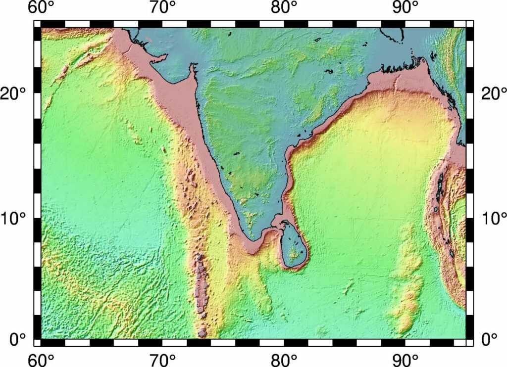
Plot the coastlines/shorelines on the map
Figure.coast can be used to plot continents, shorelines, rivers, and borders on maps. For details, visit pygmt.Figure.coast.
fig.coast(
    region=[minlon, maxlon, minlat, maxlat],
    projection='M4i',
    shorelines=True,
    frame=True
    )
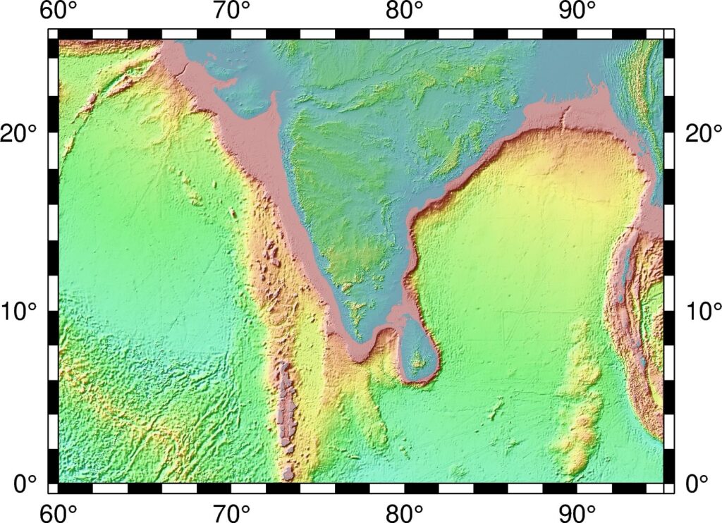
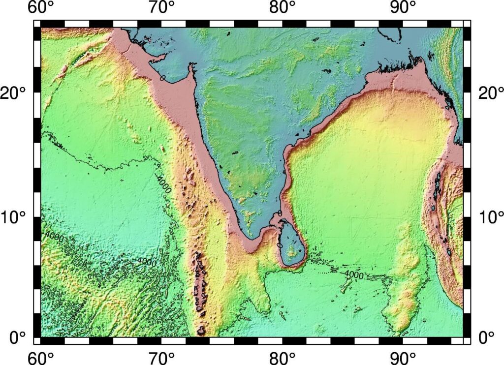
Plot the topographic contour lines
We can also plot the topographic contour lines to emphasize the change in topography. Here, I used the contour intervals of 4000 km and only show contours with elevation less than 0km.
fig.grdcontour(
    grid=topo_data,
    interval=4000,
    annotation="4000+f6p",
    limit="-8000/0",
    pen="a0.15p"
    )
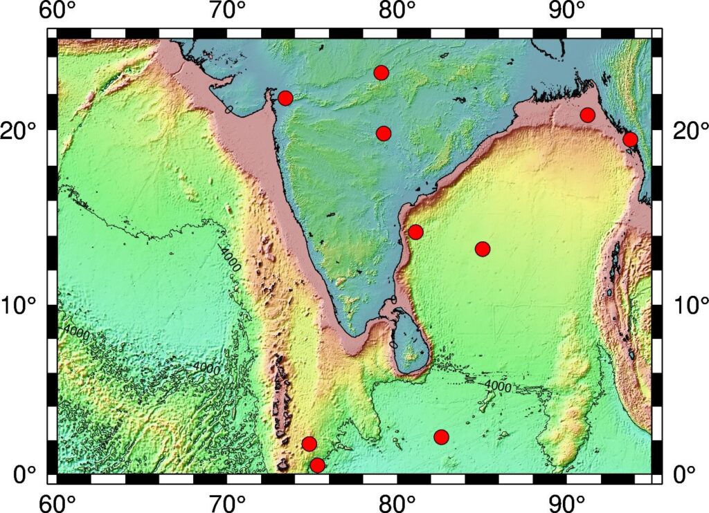
Plot data on the topographic map
## Generate fake coordinates in the range for plotting
lons = minlon + np.random.rand(10)*(maxlon-minlon)
lats = minlat + np.random.rand(10)*(maxlat-minlat)
# plot data points
fig.plot(
    x=lons,
    y=lats,
    style='c0.1i',
    color='red',
    pen='black',
    label='something',
    )
We plot the locations by red cicles. You can change the markers to any other marker supported by GMT, for example a0.1i will produce stars of size 0.1 inches.
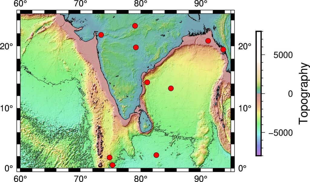
Plot colorbar for the topography
Default is horizontal colorbar
# Plot colorbar
fig.colorbar(
    frame='+l"Topography"'
    )
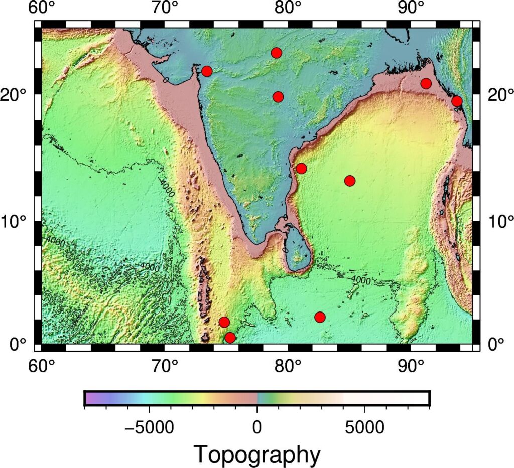
For vertical colorbar:
# For vertical colorbar
fig.colorbar(
frame='+l"Topography"',
position="x11.5c/6.6c+w6c+jTC+v"
)
We can define the location of the colorbar using the string x11.5c/6.6c+w6c+jTC+v. +v specifies the vertical colorbar.
Output the figure to a file
Similar to matplotlib, PyGMT shows the figure by
# save figure
fig.show() #fig.show(method='external')
To save figure to png. PyGMT crops the figure by default and has output figure resolution of 300 dpi for png and 720 dpi for pdf. There are several other output formats available as well.
# save figure
fig.savefig("topo-plot.png", crop=True, dpi=300, transparent=True)
fig.savefig("topo-plot.pdf", crop=True, dpi=720)
If you want to save all formats (e.g., pdf, eps, tif) then
allformat = 1

if allformat:
    fig.savefig("topo-plot.pdf", crop=True, dpi=720)
    fig.savefig("topo-plot.eps", crop=True, dpi=300)
    fig.savefig("topo-plot.tif", crop=True, dpi=300, anti_alias=True)
Complete Script
import numpy as np
import pygmt

np.random.seed(0)

minlon, maxlon = 60, 95
minlat, maxlat = 0, 25

## Generate fake coordinates in the range for plotting
lons = minlon + np.random.rand(10)*(maxlon-minlon)
lats = minlat + np.random.rand(10)*(maxlat-minlat)


#define etopo data file
topo_data = '@earth_relief_30s' #30 arc second global relief (SRTM15+V2.1 @ 1.0 km)


# Visualization
fig = pygmt.Figure()

# make color pallets
pygmt.makecpt(
    cmap='topo',
    series='-8000/8000/1000',
    continuous=True
)

#plot high res topography
fig.grdimage(
    grid=topo_data,
    region=[minlon, maxlon, minlat, maxlat],
    projection='M4i',
    shading=True,
    frame=True
    )

# plot coastlines
fig.coast(
    region=[minlon, maxlon, minlat, maxlat],
    projection='M4i',
    shorelines=True,
    frame=True
    )

# plot topo contour lines
fig.grdcontour(
    grid=topo_data,
    interval=4000,
    annotation="4000+f6p",
    # annotation="1000+f6p",
    limit="-8000/0",
    pen="a0.15p"
    )

# plot data points
fig.plot(
    x=lons,
    y=lats,
    style='c0.1i',
    color='red',
    pen='black',
    label='something',
    )

## Plot colorbar
# Default is horizontal colorbar
fig.colorbar(
    frame='+l"Topography"'
    )


# save figure as pdf
fig.savefig("topo-plot.pdf", crop=True, dpi=720)
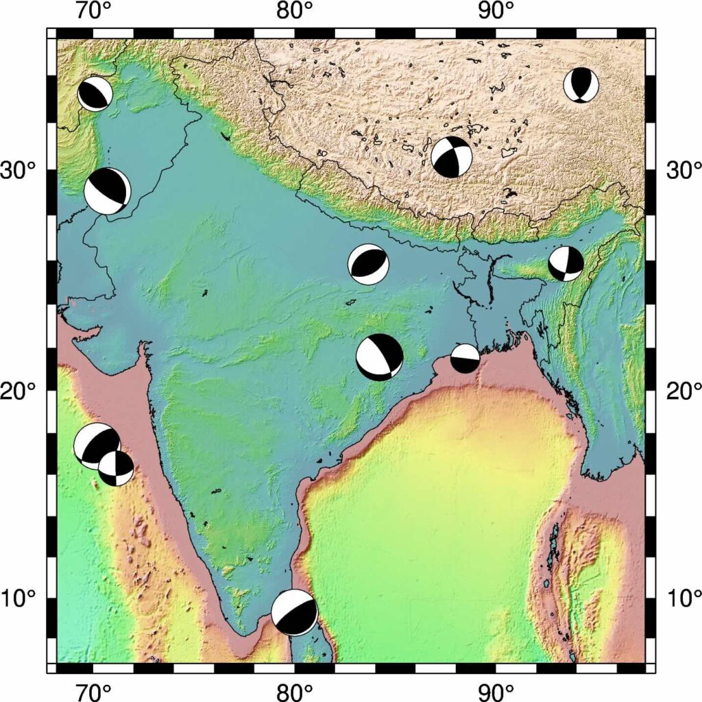
Plot Focal Mechanism on a Map
How would you plot the focal mechanism on a map? This can be simply done in GMT using the command psmeca. But PyGMT do not support psmeca so far. So, we use a workaround. We call the GMT module using the PyGMT’s pygmt.clib.Session class. This we do using the context manager with in Python.
import pygmt
import numpy as np

minlon, maxlon = 70, 100
minlat, maxlat = 0, 35

## Generate fake coordinates in the range for plotting
num_fm = 15
lons = minlon + np.random.rand(num_fm)*(maxlon-minlon)
lats = minlat + np.random.rand(num_fm)*(maxlat-minlat)

strikes = np.random.randint(low = 0, high = 360, size = num_fm)
dips = np.random.randint(low = 0, high = 90, size = num_fm)
rakes = np.random.randint(low = 0, high = 360, size = num_fm)
magnitudes = np.random.randint(low = 5, high = 9, size = num_fm)

#define etopo data file
topo_data = '@earth_relief_30s' #30 arc second global relief (SRTM15+V2.1 @ 1.0 km)


fig = pygmt.Figure()

# make color pallets
pygmt.makecpt(
    cmap='topo',
    series='-8000/11000/1000',
    continuous=True
)

#plot high res topography
fig.grdimage(
    grid=topo_data,
    region='IN',
    projection='M4i',
    shading=True,
    frame=True
    )

fig.coast( region='IN',
    projection='M4i',
    frame=True,
    shorelines=True,
    borders=1, #political boundary
)

for lon, lat, st, dp, rk, mg in zip(lons, lats, strikes, dips, rakes, magnitudes):
    with pygmt.helpers.GMTTempFile() as temp_file:
        with open(temp_file.name, 'w') as f:
            f.write(f'{lon} {lat} 0 {st} {dp} {rk} {mg} 0 0') #moment tensor: lon, lat, depth, strike, dip, rake, magnitude
        with pygmt.clib.Session() as session:
            session.call_module('meca', f'{temp_file.name} -Sa0.2i')

fig.savefig("fm-plot.pdf", crop=True, dpi=720)
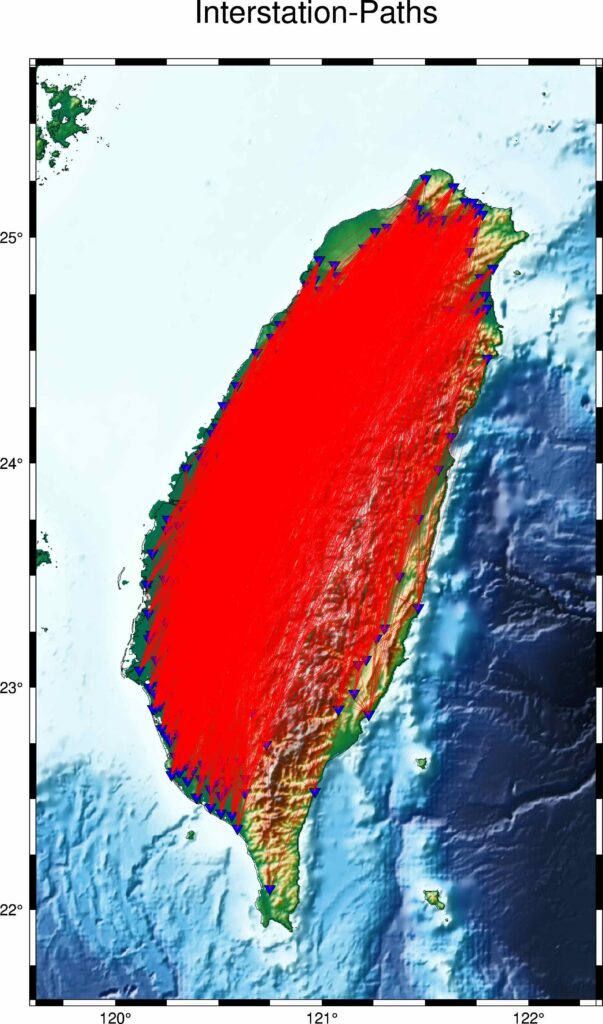
Plotting interstation paths between two stations
The following script uses the sel_pair_csv file for the coordinates of the pairs of stations. The sel_pair_csv file is a csv file that is formatted like:
   stn1     stlo1    stla1  stn2     stlo2    stla2
0  A002  121.4669  25.1258  B077  120.7874  23.8272
1  A002  121.4669  25.1258  B117  120.4684  24.1324
2  A002  121.4669  25.1258  B123  120.5516  24.0161
3  A002  121.4669  25.1258  B174  120.8055  24.2269
4  A002  121.4669  25.1258  B183  120.4163  23.8759
df_info = pd.read_csv(sel_pair_csv, names=["stn1", "stlo1", "stla1", "stn2", "stlo2", "stla2"], header=None)
event_fig = os.path.join("." , "interstation_map.png")
plot_map = 1
if plot_map:
    topo_data = "@earth_relief_15s"
    res = "f"
    figtitle="Interstation-Paths"
    frame =  ["a1f0.25", f"WSen+t{figtitle}"]
    colormap = "geo"
    minlon, maxlon, minlat, maxlat = (
        min(df_info["stlo1"].min(),df_info["stlo2"].min()),
        max(df_info["stlo1"].max(),df_info["stlo2"].max()),
        min(df_info["stla1"].min(),df_info["stla2"].min()),
        max(df_info["stla1"].max(),df_info["stla2"].max()),
    )

    dcoord = 0.5
    minlon, maxlon, minlat, maxlat = (
        minlon - dcoord,
        maxlon + dcoord,
        minlat - dcoord,
        maxlat + dcoord,
    )
    fig = pygmt.Figure()
    fig.basemap(region=[minlon, maxlon, minlat, maxlat], projection="M6i", frame=frame)
    fig.grdimage(
        grid=topo_data,
        shading=True,
        cmap=colormap,
    )

    fig.coast(
        frame=frame,
        resolution=res,
        shorelines=["1/0.2p,black", "2/0.05p,gray"],
        borders=1,
    )


    fig.plot(
        x=df_info["stlo1"].values,
        y=df_info["stla1"].values,
        style="i10p",
        color="blue",
        pen="black",
    )
    fig.plot(
            x=df_info["stlo2"].values,
            y=df_info["stla2"].values,
            style="i10p",
            color="blue",
            pen="black",
        )
    print("Plotting paths now...")
    for stn1, stn2, stlo1, stla1, stlo2, stla2 in zip(df_info["stn1"].values, df_info["stn2"].values, df_info["stlo1"].values,df_info["stla1"].values,df_info["stlo2"].values,df_info["stla2"].values):
        print(f"-->{stn1}-{stn2}")

        fig.plot(
            x=[stlo1,stlo2],
            y=[stla1,stla2],
            pen="0.1p,red,-",
            straight_line=1,
        )

    fig.savefig(event_fig, crop=True, dpi=300)
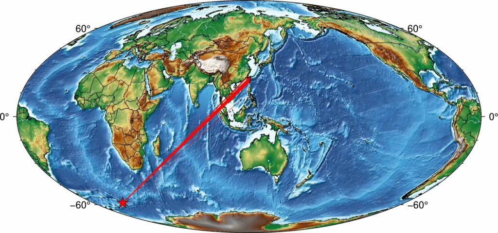
Event-Station Map
import pygmt
import pandas as pd
def plot_event_moll_map(df_info, event, event_fig, clon=None, colormap='geo', topo_data = "@earth_relief_20m"):
    '''
    Utpal Kumar
    2021, March
    param df_info: pandas dataframe containing the event and station coordinates (type: pandas DataFrame)
    param event: event name (type: str)
    param event_fig: output figure name (type str)
    param clon: central longitude (type float)
    '''
    res = "f"
    if not colormap:
        colormap = "geo"

    if not clon:
        clon = df_info["stlo"].mean()
    proj = f"W{clon:.1f}/20c"

    fig = pygmt.Figure()
    fig.basemap(region="g", projection=proj, frame=True)
    fig.grdimage(
        grid=topo_data,
        shading=True,
        cmap=colormap,
    )

    fig.coast(
        resolution=res,
        shorelines=["1/0.2p,black", "2/0.05p,gray"],
        borders=1,
    )
    fig.plot(
        x=df_info["stlo"].values,
        y=df_info["stla"].values,
        style="i2p",
        color="blue",
        pen="black",
        label="Station",
    )
    fig.plot(
        x=df_info["evlo"].values[0],
        y=df_info["evla"].values[0],
        style="a15p",
        color="red",
        pen="black",
        label="Event",
    )
    for stlo, stla in zip(df_info["stlo"].values, df_info["stla"].values):
        fig.plot(
            x=[df_info["evlo"].values[0], stlo],
            y=[df_info["evla"].values[0], stla],
            pen="red",
            straight_line=1,
        )

    fig.savefig(event_fig, crop=True, dpi=300)

if __name__=="__main__":
    event="test_event"
    data_info_file = f"data_info_{event}.txt"
    event_fig = f"event_map_{event}.png"

    df_info = pd.read_csv(data_info_file)
    plot_event_moll_map(df_info, event, event_fig)
Here, I used the Mollweide projection but this code can be applied for any other projections with a little tweak.
The first few lines of the data file are:
network,station,channel,stla,stlo,stel,evla,evlo,evdp,starttime,endtime,samplingRate,dist,baz
TW,GWUB,HHZ,24.5059,121.1131,2159.0,-58.5981,-26.4656,164.66,2018-12-11T02:25:32.000002Z,2018-12-11T03:56:31.990002Z,100.0,15445.41,205.14
TW,LXIB,HHZ,24.0211,121.4133,1327.0,-58.5981,-26.4656,164.66,2018-12-11T02:25:32.000000Z,2018-12-11T03:56:31.990000Z,100.0,15409.58,204.75
TW,VCHM,HHZ,23.2087,119.4295,60.0,-58.5981,-26.4656,164.66,2018-12-11T02:25:32.000000Z,2018-12-11T03:56:31.990000Z,100.0,15242.27,205.4
TW,VDOS,HHZ,20.701,116.7306,5.0,-58.5981,-26.4656,164.66,2018-12-11T02:25:32.000000Z,2018-12-11T03:56:31.990000Z,100.0,14871.63,205.6
TW,VNAS,HHZ,10.3774,114.365,2.0,-58.5981,-26.4656,164.66,2018-12-11T02:25:32.000000Z,2018-12-11T03:56:31.990000Z,100.0,13726.26,203.23
TW,VWDT,HHZ,23.7537,121.1412,2578.0,-58.5981,-26.4656,164.66,2018-12-11T02:25:32.000000Z,2018-12-11T03:56:31.990000Z,100.0,15371.08,204.77
TW,VWUC,HHZ,24.9911,119.4492,42.0,-58.5981,-26.4656,164.66,2018-12-11T02:25:32.000000Z,2018-12-11T03:56:31.990000Z,100.0,15420.85,206.25
TW,YD07,HHZ,25.1756,121.62,442.0,-58.5981,-26.4656,164.66,2018-12-11T02:25:32.000000Z,2018-12-11T03:56:31.990000Z,100.0,15534.34,205.2
TW,HOPB,HHZ,24.3328,121.6929,160.0,-58.5981,-26.4656,164.66,2018-12-11T02:25:32.003130Z,2018-12-11T03:56:31.993130Z,100.0,15452.83,204.75
TW,SYNB,HHZ,23.2482,120.9862,2352.0,-58.5981,-26.4656,164.66,2018-12-11T02:25:32.003131Z,2018-12-11T03:56:31.993131Z,100.0,15313.6,204.62
TW,DYSB,HHZ,24.8208,121.4049,1000.0,-58.5981,-26.4656,164.66,2018-12-11T02:25:32.008393Z,2018-12-11T03:56:31.998393Z,100.0,15489.54,205.14
TW,FUSB,HHZ,24.7597,121.5875,690.0,-58.5981,-26.4656,164.66,2018-12-11T02:25:32.008394Z,2018-12-11T03:56:31.998394Z,100.0,15491.23,205.01
TW,HGSD,HHZ,23.4921,121.4239,134.8,-58.5981,-26.4656,164.66,2018-12-11T02:25:32.008393Z,2018-12-11T03:56:31.998393Z,100.0,15356.77,204.5
---
References
- Uieda, L., Wessel, P., 2019. PyGMT: Accessing the Generic Mapping Tools from Python. AGUFM 2019, NS21B–0813.
- Wessel, P., Luis, J.F., Uieda, L., Scharroo, R., Wobbe, F., Smith, W.H.F., Tian, D., 2019. The Generic Mapping Tools Version 6. Geochemistry, Geophys. Geosystems 20, 5556–5564. https://doi.org/10.1029/2019GC008515


Hello, I do believe your website might be having internet browser compatibility issues. Whenever I look at your web site in Safari, it looks fine however, when opening in IE, it has some overlapping issues. I merely wanted to give you a quick heads up! Aside from that, wonderful website!
Wow, wonderful blog layout! How long have you been blogging for? you make blogging look easy. The overall look of your site is magnificent, let alone the content!
My developer is trying to convince me to move to .net from PHP. I have always disliked the idea because of the costs. But he’s tryiong none the less. I’ve been using WordPress on numerous websites for about a year and am nervous about switching to another platform. I have heard fantastic things about blogengine.net. Is there a way I can import all my wordpress posts into it? Any help would be really appreciated!
Heya! I just wanted to ask if you ever have any issues with hackers? My last blog (wordpress) was hacked and I ended up losing a few months of hard work due to no data backup. Do you have any methods to stop hackers?
Terrific post but I was wondering if you could write a litte more on this topic? I’d be very grateful if you could elaborate a little bit more. Kudos!
Keep this going please, great job!
Thanks for every other informative website. The place else may just I am getting that kind of information written in such a perfect approach? I’ve a undertaking that I am simply now working on, and I’ve been on the look out for such information.
I’m gone to convey my little brother, that he should also visit this weblog on regular basis to take updated from latest news update.
I have been browsing online more than 3 hours today, yet I never found any interesting article like yours. It is pretty worth enough for me. Personally, if all web owners and bloggers made good content as you did, the internet will be a lot more useful than ever before.
Wow that was unusual. I just wrote an really long comment but after I clicked submit my comment didn’t show up. Grrrr… well I’m not writing all that over again. Anyways, just wanted to say superb blog!
If some one needs expert view about running a blog after that i propose him/her to visit this weblog, Keep up the good work.
Wow that was strange. I just wrote an incredibly long comment but after I clicked submit my comment didn’t show up. Grrrr… well I’m not writing all that over again. Anyways, just wanted to say fantastic blog!
Great blog here! Also your website loads up fast! What host are you using? Can I get your affiliate link to your host? I wish my site loaded up as quickly as yours lol
Why people still use to read news papers when in this technological globe the whole thing is presented on web?
This website was… how do I say it? Relevant!! Finally I have found something that helped me. Thanks a lot!
Hello! I know this is somewhat off topic but I was wondering which blog platform are you using for this site? I’m getting sick and tired of WordPress because I’ve had issues with hackers and I’m looking at options for another platform. I would be great if you could point me in the direction of a good platform.
What’s up, I check your blogs daily. Your writing style is awesome, keep up the good work!
Excellent post. I was checking continuously this blog and I am impressed! Very useful info specifically the last part 🙂 I care for such information a lot. I was seeking this certain info for a long time. Thank you and best of luck.
I think the admin of this site is genuinely working hard for his web page, because here every stuff is quality based stuff.
Hello, just wanted to tell you, I liked this post. It was helpful. Keep on posting!
I have read so many content regarding the blogger lovers however this paragraph is actually a nice post, keep it up.
Hello there! I know this is kinda off topic however I’d figured I’d ask. Would you be interested in trading links or maybe guest writing a blog post or vice-versa? My blog addresses a lot of the same topics as yours and I feel we could greatly benefit from each other. If you are interested feel free to shoot me an e-mail. I look forward to hearing from you! Excellent blog by the way!
I think this is one of the most important info for me. And i’m glad reading your article. But should remark on some general things, The website style is wonderful, the articles is really nice : D. Good job, cheers
Very great post. I simply stumbled upon your blog and wished to mention that I have truly loved browsing your weblog posts. After all I’ll be subscribing on your rss feed and I am hoping you write again soon!
I’m not sure why but this website is loading incredibly slow for me. Is anyone else having this issue or is it a problem on my end? I’ll check back later and see if the problem still exists.
There’s definately a great deal to learn about this issue. I love all the points you made.
I have been exploring for a little for any high quality articles or weblog posts on this kind of space . Exploring in Yahoo I at last stumbled upon this web site. Reading this information So i am glad to show that I’ve an incredibly just right uncanny feeling I found out exactly what I needed. I most indubitably will make certain to don?t overlook this site and provides it a look regularly.
Simply want to say your article is as surprising. The clearness in your put up is just cool and that i can think you’re knowledgeable in this subject. Fine together with your permission allow me to clutch your feed to stay up to date with drawing close post. Thank you a million and please continue the gratifying work.
Howdy, i read your blog occasionally and i own a similar one and i was just wondering if you get a lot of spam comments? If so how do you reduce it, any plugin or anything you can recommend? I get so much lately it’s driving me crazy so any support is very much appreciated.
you’re in point of fact a good webmaster. The website loading velocity is amazing. It kind of feels that you are doing any distinctive trick. Moreover, The contents are masterpiece. you have done a fantastic activity in this topic!
I am not sure the place you’re getting your info, but good topic. I needs to spend some time studying more or working out more. Thanks for great information I used to be looking for this info for my mission.
Hello! I could have sworn I’ve been to this website before but after checking through some of the post I realized it’s new to me. Anyhow, I’m definitely delighted I found it and I’ll be book-marking and checking back often!
May I simply say what a comfort to discover somebody who actually understands what they’re talking about online. You definitely know how to bring an issue to light and make it important. A lot more people have to check this out and understand this side of the story. I was surprised you’re not more popular given that you certainly have the gift.
These are really enormous ideas in concerning blogging. You have touched some fastidious factors here. Any way keep up wrinting.
I every time spent my half an hour to read this weblog’s posts daily along with a mug of coffee.
Hi there, just wanted to mention, I loved this post. It was funny. Keep on posting!
You can definitely see your expertise in the work you write. The sector hopes for more passionate writers like you who are not afraid to mention how they believe. Always follow your heart.
Fascinating blog! Is your theme custom made or did you download it from somewhere? A design like yours with a few simple tweeks would really make my blog jump out. Please let me know where you got your design. Thank you
It’s a shame you don’t have a donate button! I’d without a doubt donate to this superb blog! I guess for now i’ll settle for bookmarking and adding your RSS feed to my Google account. I look forward to new updates and will share this website with my Facebook group. Talk soon!
Hi there! Do you use Twitter? I’d like to follow you if that would be ok. I’m absolutely enjoying your blog and look forward to new updates.
whoah this blog is magnificent i like studying your articles. Keep up the good work! You realize, many persons are hunting round for this info, you could aid them greatly.
I am really thankful to the owner of this web site who has shared this fantastic piece of writing at here.
This is a topic that’s close to my heart… Many thanks! Exactly where are your contact details though?
I have been surfing on-line greater than three hours today, but I by no means discovered any fascinating article like yours. It is beautiful value sufficient for me. In my opinion, if all website owners and bloggers made just right content as you did, the internet will probably be much more helpful than ever before.
I’m impressed, I have to admit. Seldom do I come across a blog that’s both equally educative and entertaining, and without a doubt, you’ve hit the nail on the head. The problem is something that too few men and women are speaking intelligently about. Now i’m very happy I found this during my hunt for something relating to this.
Good way of describing, and pleasant post to obtain facts regarding my presentation topic, which i am going to convey in school.
This is a topic that’s near to my heart… Take care! Exactly where are your contact details though?
Hello would you mind sharing which blog platform you’re using? I’m looking to start my own blog soon but I’m having a tough time choosing between BlogEngine/Wordpress/B2evolution and Drupal. The reason I ask is because your design seems different then most blogs and I’m looking for something completely unique. P.S My apologies for being off-topic but I had to ask!
Hello there! I could have sworn I’ve visited your blog before but after going through some of the articles I realized it’s new to me. Regardless, I’m definitely pleased I discovered it and I’ll be book-marking it and checking back often!
This paragraph is truly a good one it helps new internet users, who are wishing in favor of blogging.
Hey! I’m at work browsing your blog from my new iphone 4! Just wanted to say I love reading through your blog and look forward to all your posts! Keep up the outstanding work!
You definitely made your point.
I’m really impressed together with your writing talents and also with the layout in your blog. Is this a paid topic or did you customize it your self? Either way stay up the nice quality writing, it is rare to look a great blog like this one today..
Way cool! Some very valid points! I appreciate you writing this write-up and the rest of the website is really good.
Very great post. I simply stumbled upon your blog and wished to mention that I’ve really loved surfing around your weblog posts. In any case I will be subscribing on your feed and I’m hoping you write once more soon!
I would like to thank you for the efforts you’ve put in writing this website. I really hope to see the same high-grade blog posts from you later on as well. In fact, your creative writing abilities has inspired me to get my very own site now 😉
you’re really a good webmaster. The web site loading velocity is amazing. It kind of feels that you’re doing any distinctive trick. Moreover, The contents are masterpiece. you’ve performed a magnificent process on this topic!
Great work! This is the kind of information that should be shared around the internet. Shame on Google for now not positioning this put up higher! Come on over and talk over with my site . Thank you =)
Terrific post however , I was wanting to know if you could write a litte more on this topic? I’d be very grateful if you could elaborate a little bit more. Cheers!
May I simply just say what a comfort to find a person that truly understands what they’re discussing on the web. You definitely understand how to bring an issue to light and make it important. More people really need to look at this and understand this side of the story. I can’t believe you aren’t more popular given that you certainly have the gift.
Hello everybody, here every person is sharing these kinds of know-how, therefore it’s pleasant to read this web site, and I used to go to see this website everyday.
This site was… how do you say it? Relevant!! Finally I’ve found something which helped me. Cheers!
Great article.
Saved as a favorite, I really like your site!
When I initially commented I clicked the “Notify me when new comments are added” checkbox and now each time a comment is added I get four emails with the same comment. Is there any way you can remove me from that service? Appreciate it!
You’ve made some good points there. I checked on the internet for additional information about the issue and found most people will go along with your views on this site.
Hi there! This post could not be written any better! Reading through this post reminds me of my previous room mate! He always kept chatting about this. I will forward this article to him. Pretty sure he will have a good read. Many thanks for sharing!
I am actually delighted to read this web site posts which consists of tons of useful facts, thanks for providing such data.
My brother recommended I may like this web site. He was entirely right. This publish truly made my day. You cann’t believe just how much time I had spent for this information! Thanks!
Hmm is anyone else having problems with the pictures on this blog loading? I’m trying to determine if its a problem on my end or if it’s the blog. Any suggestions would be greatly appreciated.
Please let me know if you’re looking for a article author for your weblog. You have some really great articles and I feel I would be a good asset. If you ever want to take some of the load off, I’d absolutely love to write some content for your blog in exchange for a link back to mine. Please shoot me an email if interested. Cheers!
Undeniably believe that that you said. Your favourite reason appeared to be on the net the simplest factor to be aware of. I say to you, I certainly get irked while other people think about issues that they plainly do not recognise about. You managed to hit the nail upon the top and defined out the entire thing with no need side effect , people could take a signal. Will likely be again to get more. Thanks
This piece of writing is really a good one it helps new the web people, who are wishing for blogging.
Hey I know this is off topic but I was wondering if you knew of any widgets I could add to my blog that automatically tweet my newest twitter updates. I’ve been looking for a plug-in like this for quite some time and was hoping maybe you would have some experience with something like this. Please let me know if you run into anything. I truly enjoy reading your blog and I look forward to your new updates.
After looking into a few of the blog articles on your website, I seriously appreciate your way of writing a blog. I added it to my bookmark webpage list and will be checking back in the near future. Please visit my web site as well and tell me how you feel.
My family all the time say that I am killing my time here at net, however I know I am getting familiarity everyday by reading thes nice content.
It’s very easy to find out any matter on net as compared to textbooks, as I found this paragraph at this site.
Yes! Finally someone writes about %keyword1%.
you are truly a just right webmaster. The website loading pace is incredible. It kind of feels that you’re doing any distinctive trick. Also, The contents are masterwork. you have performed a wonderful process in this matter!
Thankfulness to my father who informed me on the topic of this website, this weblog is in fact awesome.
I’m pretty pleased to discover this site. I want to to thank you for ones time due to this wonderful read!! I definitely loved every part of it and I have you bookmarked to see new stuff on your blog.
For newest news you have to visit world-wide-web and on world-wide-web I found this website as a finest web site for newest updates.
Hello would you mind letting me know which hosting company you’re utilizing? I’ve loaded your blog in 3 different web browsers and I must say this blog loads a lot quicker then most. Can you recommend a good internet hosting provider at a honest price? Kudos, I appreciate it!
Sweet blog! I found it while surfing around on Yahoo News. Do you have any suggestions on how to get listed in Yahoo News? I’ve been trying for a while but I never seem to get there! Appreciate it
This site was… how do you say it? Relevant!! Finally I’ve found something which helped me. Cheers!
Incredible points. Outstanding arguments. Keep up the great work.
I am regular visitor, how are you everybody? This piece of writing posted at this site is in fact pleasant.
Nice post. I learn something totally new and challenging on websites I stumbleupon on a daily basis. It’s always exciting to read articles from other writers and use something from other sites.
When I initially left a comment I appear to have clicked on the -Notify me when new comments are added- checkbox and from now on each time a comment is added I receive 4 emails with the exact same comment. There has to be an easy method you are able to remove me from that service? Thank you!
May I simply say what a comfort to discover someone that really knows what they are talking about on the web. You actually understand how to bring an issue to light and make it important. More and more people should look at this and understand this side of your story. I can’t believe you’re not more popular given that you definitely possess the gift.
If you wish for to take much from this paragraph then you have to apply these strategies to your won weblog.
Good day very cool site!! Man .. Excellent .. Superb .. I’ll bookmark your blog and take the feeds also? I am happy to search out a lot of helpful info right here in the submit, we’d like develop more techniques on this regard, thank you for sharing. . . . . .
Good day! I know this is kinda off topic however , I’d figured I’d ask. Would you be interested in trading links or maybe guest authoring a blog article or vice-versa? My site addresses a lot of the same topics as yours and I think we could greatly benefit from each other. If you happen to be interested feel free to shoot me an e-mail. I look forward to hearing from you! Fantastic blog by the way!
Having read this I believed it was very informative. I appreciate you taking the time and effort to put this information together. I once again find myself personally spending a lot of time both reading and posting comments. But so what, it was still worthwhile!
Greetings, There’s no doubt that your web site could be having internet browser compatibility problems. Whenever I take a look at your web site in Safari, it looks fine however, when opening in Internet Explorer, it’s got some overlapping issues. I just wanted to provide you with a quick heads up! Aside from that, excellent blog!
Thank you for every other informative web site. Where else may I am getting that type of information written in such an ideal means? I have a venture that I’m just now running on, and I’ve been at the glance out for such info.
I’ve been exploring for a little bit for any high quality articles or blog posts on this kind of space . Exploring in Yahoo I at last stumbled upon this website. Reading this information So i’m glad to exhibit that I have an incredibly just right uncanny feeling I discovered just what I needed. I most undoubtedly will make sure to don?t disregard this site and give it a look regularly.
With havin so much content do you ever run into any issues of plagorism or copyright violation? My site has a lot of exclusive content I’ve either written myself or outsourced but it appears a lot of it is popping it up all over the web without my permission. Do you know any ways to help protect against content from being ripped off? I’d really appreciate it.
No matter if some one searches for his necessary thing, so he/she desires to be available that in detail, therefore that thing is maintained over here.
Hello! I realize this is somewhat off-topic however I needed
to ask. Does building a well-established website such as
yours require a lot of work? I’m brand new to operating a blog however I do write in my diary everyday.
I’d like to start a blog so I will be able to share my personal experience and thoughts online.
Please let me know if you have any kind of recommendations or tips
for brand new aspiring bloggers. Appreciate it!
You actually make it seem really easy together with your presentation however I to find this topic to be actually one thing which I believe I might by no means understand. It kind of feels too complicated and extremely large for me. I’m looking forward on your subsequent put up, I’ll try to get the hold of it!
Hello just wanted to give you a quick heads up. The text in your post seem to be running off the screen in Safari. I’m not sure if this is a formatting issue or something to do with web browser compatibility but I thought I’d post to let you know. The style and design look great though! Hope you get the issue solved soon. Kudos
I know this if off topic but I’m looking into starting my own weblog and was wondering what all is needed to get set up? I’m assuming having a blog like yours would cost a pretty penny? I’m not very web savvy so I’m not 100% positive. Any tips or advice would be greatly appreciated. Many thanks
Spot on with this write-up, I truly believe this web site needs a lot more attention. I’ll probably be back again to read more, thanks for the information!
Hello everyone, it’s my first go to see at this website, and post is actually fruitful in favor of me, keep up posting such articles or reviews.
Does your website have a contact page? I’m having trouble locating it but, I’d like to send you an e-mail. I’ve got some creative ideas for your blog you might be interested in hearing. Either way, great website and I look forward to seeing it grow over time.
No matter if some one searches for his necessary thing, thus he/she needs to be available that in detail, so that thing is maintained over here.
Today, I went to the beachfront with my children. I found a sea shell and gave it to my 4 year old daughter and said “You can hear the ocean if you put this to your ear.” She put the shell to her ear and screamed. There was a hermit crab inside and it pinched her ear. She never wants to go back! LoL I know this is entirely off topic but I had to tell someone!
After checking out a number of the blog posts on your web site, I honestly like your way of blogging. I saved it to my bookmark website list and will be checking back in the near future. Please visit my website too and let me know what you think.
Aw, this was a very nice post. Taking the time and actual effort to make a good article… but what can I say… I procrastinate a lot and don’t manage to get anything done.
Its like you read my mind! You appear to know a lot about this, like you wrote the book in it or something. I think that you could do with some pics to drive the message home a little bit, but instead of that, this is fantastic blog. A great read. I will definitely be back.
It’s a shame you don’t have a donate button! I’d definitely donate to this superb blog! I guess for now i’ll settle for book-marking and adding your RSS feed to my Google account. I look forward to new updates and will share this site with my Facebook group. Chat soon!
I am really loving the theme/design of your blog. Do you ever run into any browser compatibility issues? A few of my blog visitors have complained about my website not working correctly in Explorer but looks great in Firefox. Do you have any tips to help fix this problem?
Your style is unique compared to other people I have read stuff from. Thanks for posting when you’ve got the opportunity, Guess I will just book mark this site.
Greate article. Keep posting such kind of information on your site. Im really impressed by it.
Hello there, You have performed an excellent job. I will definitely digg it and for my part suggest to my friends. I am sure they will be benefited from this website.
Wow, amazing weblog format! How long have you been running a blog for? you make blogging look easy. The overall glance of your web site is wonderful, as well as the content!
Every weekend i used to pay a quick visit this web site, because i want enjoyment, for the
reason that this this site conations genuinely good funny material too.
Excellent weblog right here! Additionally your website rather a lot up very fast! What web host are you the usage of? Can I am getting your affiliate link on your host? I desire my web site loaded up as quickly as yours lol
When I originally commented I clicked the “Notify me when new comments are added” checkbox and now each time a comment is added I get four e-mails with the same comment. Is there any way you can remove me from that service? Bless you!
When I initially commented I clicked the “Notify me when new comments are added” checkbox and now each time a comment is added I get three e-mails with the same comment. Is there any way you can remove me from that service? Thanks!
This is really interesting, You’re a very skilled blogger. I’ve joined your feed and look forward to seeking more of your magnificent post. Also, I have shared your website in my social networks!
Great items from you, man. I’ve remember your stuff previous to and you’re just extremely wonderful. I actually like what you have obtained here, really like what you’re stating and the best way during which you are saying it. You make it enjoyable and you continue to take care of to stay it sensible. I can’t wait to learn much more from you. This is actually a terrific website.
This paragraph will assist the internet users for creating new website or even a blog from start to end.
excellent publish, very informative. I’m wondering why the opposite specialists of this sector don’t realize this. You should proceed your writing. I am confident, you have a great readers’ base already!
Thankfulness to my father who told me about this weblog, this webpage is really awesome.
Please let me know if you’re looking for a article writer for your weblog. You have some really great articles and I think I would be a good asset. If you ever want to take some of the load off, I’d absolutely love to write some articles for your blog in exchange for a link back to mine. Please blast me an email if interested. Cheers!
Everything is very open with a clear clarification of the issues. It was really informative. Your site is extremely helpful. Thank you for sharing!
Having read this I thought it was rather informative. I appreciate you spending some time and effort to put this short article together. I once again find myself spending a lot of time both reading and posting comments. But so what, it was still worth it!
Somebody necessarily help to make seriously articles I’d state. This is the very first time I frequented your website page and thus far? I amazed with the research you made to create this actual submit extraordinary. Excellent process!
Hi admin and users.
I have a quick question about studying abroad.
They have offices in Tokyo and Kobe.
More info here:
[url=https://www.wintechjapan.com/]кракен ссылка[/url]
Let me know what you think.
Thank you, I have recently been looking for info about this topic for ages and yours is the best I’ve came upon till now. But, what in regards to the bottom line? Are you positive concerning the supply?
It’s an remarkable paragraph designed for all the internet visitors; they will obtain benefit from it I am sure.
If you desire to improve your experience just keep visiting this website and be updated with the hottest news update posted here.
I do not even know how I ended up here, but I thought this post was good. I don’t know who you are but certainly you’re going to a famous blogger if you aren’t already 😉 Cheers!
Howdy! This is kind of off topic but I need some help from an established blog. Is it very hard to set up your own blog? I’m not very techincal but I can figure things out pretty fast. I’m thinking about creating my own but I’m not sure where to start. Do you have any ideas or suggestions? With thanks
Very great post. I just stumbled upon your blog and wanted to say that I’ve truly enjoyed browsing your weblog posts. After all I will be subscribing for your rss feed and I hope you write again soon!
Wow! This blog looks just like my old one! It’s on a totally different topic but it has pretty much the same layout and design. Outstanding choice of colors!
Howdy fantastic website! Does running a blog such as this require a lot of work? I have no knowledge of coding but I had been hoping to start my own blog in the near future. Anyhow, should you have any suggestions or techniques for new blog owners please share. I know this is off subject but I simply had to ask. Thank you!
Hiya very cool website!! Man .. Excellent .. Wonderful .. I’ll bookmark your blog and take the feeds additionally? I’m satisfied to find so many useful info here within the publish, we need work out more strategies on this regard, thanks for sharing. . . . . .
Great article.
I’m gone to say to my little brother, that he should also pay a visit this website on regular basis to get updated from most recent information.
Yes! Finally someone writes about %keyword1%.
Great blog here! Also your site loads up very fast! What host are you using? Can I get your affiliate link to your host? I wish my website loaded up as fast as yours lol
Wow, marvelous blog layout! How long have you been blogging for? you made blogging look easy. The overall look of your website is excellent, let alone the content!
I like the helpful information you supply for your articles. I’ll bookmark your blog and take a look at again right here regularly. I’m quite sure I’ll be told lots of new stuff right here! Best of luck for the next!
That is a really good tip particularly to those
fresh to the blogosphere. Simple but very precise information Thanks for sharing this one.
A must read post!
Wow, amazing blog layout! How long have you been blogging for? you made blogging look easy. The overall look of your site is fantastic, as well as the content!
This is a really good tip particularly to those fresh to the blogosphere. Brief but very precise info… Many thanks for sharing this one. A must read post!
Attractive part of content. I just stumbled upon your web site and in accession capital to claim that I get actually enjoyed account your blog posts. Anyway I’ll be subscribing on your augment and even I fulfillment you access constantly rapidly.
Every weekend i used to pay a visit this website, for the reason that i wish for enjoyment, as this this web site conations truly pleasant funny information too.
Because the admin of this website is working, no doubt very rapidly it will be well-known, due to its quality contents.
I have read several excellent stuff here. Definitely price bookmarking for revisiting. I wonder how so much attempt you place to make such a great informative web site.
Wonderful, what a weblog it is! This weblog provides useful information to us, keep it up.
I all the time emailed this webpage post page to all my friends, because if like to read it next my friends will too.
Wonderful blog! Do you have any tips for aspiring writers? I’m hoping to start my own website soon but I’m a little lost on everything. Would you suggest starting with a free platform like WordPress or go for a paid option? There are so many choices out there that I’m totally confused .. Any tips? Thank you!
Hello to every one, it’s genuinely a nice for me to visit this web site, it contains helpful Information.
This is really interesting, You’re a very skilled blogger. I have joined your rss feed and look forward to seeking more of your great post. Also, I’ve shared your web site in my social networks!
Spot on with this write-up, I absolutely feel this web site needs much more attention. I’ll probably be returning to read through more, thanks for the info!
Hello! Do you know if they make any plugins to protect against hackers? I’m kinda paranoid about losing everything I’ve worked hard on. Any tips?
Hmm it appears like your site ate my first comment (it was extremely long) so I guess I’ll just sum it up what I submitted and say, I’m thoroughly enjoying your blog. I too am an aspiring blog blogger but I’m still new to everything. Do you have any suggestions for beginner blog writers? I’d certainly appreciate it.
A fascinating discussion is worth comment. I think that you should publish more about this subject matter, it may not be a taboo subject but typically folks don’t talk about such subjects. To the next! Cheers!!
I every time emailed this weblog post page to all my contacts, for the reason that if like to read it then my friends will too.
Oh my goodness! Awesome article dude! Thank you, However I am encountering issues with your RSS. I don’t understand why I can’t subscribe to it. Is there anybody getting the same RSS problems? Anyone who knows the answer can you kindly respond? Thanks!!
There is definately a lot to know about this subject. I love all the points you have made.
I am really loving the theme/design of your website. Do you ever run into any web browser compatibility problems? A number of my blog audience have complained about my site not working correctly in Explorer but looks great in Opera. Do you have any recommendations to help fix this problem?
I enjoy what you guys tend to be up too. This type of clever work and coverage! Keep up the superb works guys I’ve added you guys to my own blogroll.
If some one wishes to be updated with newest technologies therefore he must be pay a visit this web page and be up to date all the time.
Your way of telling the whole thing in this paragraph is really nice, all can without difficulty understand it, Thanks a lot.
Every weekend i used to pay a visit this web page, as i want enjoyment, as this this web page conations in fact nice funny data too.
I know this web site presents quality based articles or reviews and extra stuff, is there any other web site which gives these stuff in quality?
Excellent website. Lots of useful information here. I’m sending it to a few friends ans additionally sharing in delicious. And of course, thanks to your effort!
I have been browsing online greater than 3 hours today, but I by no means found any interesting article like yours. It’s beautiful value sufficient for me. In my view, if all webmasters and bloggers made good content as you did, the net shall be a lot more useful than ever before.
Hi, I think your website might be having browser compatibility issues. When I look at your blog site in Ie, it looks fine but when opening in Internet Explorer, it has some overlapping. I just wanted to give you a quick heads up! Other then that, awesome blog!
It’s going to be finish of mine day, however before ending I am reading this wonderful post to improve my experience.
Hey there I am so thrilled I found your website, I really found you by error, while I was browsing on Yahoo for something else, Nonetheless I am here now and would just like to say many thanks for a tremendous post and a all round entertaining blog (I also love the theme/design), I don’t have time to go through it all at the minute but I have bookmarked it and also added in your RSS feeds, so when I have time I will be back to read a great deal more, Please do keep up the fantastic work.
Greetings! Very useful advice in this particular post! It is the little changes that make the greatest changes. Many thanks for sharing!
Right here is the perfect website for anyone who wants to understand this topic. You realize so much its almost hard to argue with you (not that I personally would want to…HaHa). You certainly put a brand new spin on a topic which has been discussed for decades. Great stuff, just excellent!
Good post however , I was wanting to know if you could write a litte more on this topic? I’d be very thankful if you could elaborate a little bit more. Appreciate it!
Nice blog! Is your theme custom made or did you download it from somewhere? A design like yours with a few simple adjustements would really make my blog shine. Please let me know where you got your design. Thank you
Everything is very open with a clear explanation of the challenges. It was truly informative. Your website is very helpful. Many thanks for sharing!
Offside calls, VAR checked decisions and linesman flags documented
Very useful piece.
I really like the way you covered this matter.
It’s easy to understand and helpful for anyone.
I always look across blogs that hardly bring any depth, but this one is outstanding.
The details you gave adds so much value.
Keep up the awesome job, and I hope to checking out more
content from you in the coming days.
Thank you for posting this!
Hi there this is kind of of off topic but I was wondering if blogs use WYSIWYG editors or if you have to manually code with HTML. I’m starting a blog soon but have no coding knowledge so I wanted to get guidance from someone with experience. Any help would be enormously appreciated!
When I originally commented I clicked the “Notify me when new comments are added” checkbox and now each time a comment is added I get several e-mails with the same comment. Is there any way you can remove people from that service? Thanks a lot!
Yesterday, while I was at work, my sister stole my iphone and tested to see if it can survive a 30 foot drop, just so she can be a youtube sensation. My apple ipad is now destroyed and she has 83 views. I know this is totally off topic but I had to share it with someone!
I have read so many content on the topic of the blogger lovers but this article is in fact a pleasant article, keep it up.
Keep this going please, great job!
I used to be suggested this blog by means of my cousin. I am no longer positive whether or not this put up is written by way of him as no one else realize such distinctive approximately my difficulty. You are amazing! Thanks!
I know this if off topic but I’m looking into starting my own weblog and was curious what all is needed to get setup? I’m assuming having a blog like yours would cost a pretty penny? I’m not very internet savvy so I’m not 100% positive. Any recommendations or advice would be greatly appreciated. Cheers
Great article, exactly what I was looking for.
I’d like to find out more? I’d like to find out more details.
Just want to say your article is as amazing. The clearness in your post is simply cool and i could assume you are an expert on this subject. Fine with your permission allow me to grab your feed to keep updated with forthcoming post. Thanks a million and please continue the rewarding work.
I’ve been browsing on-line more than three hours as of
late, yet I never discovered any attention-grabbing article like yours.
It is beautiful price enough for me. Personally, if all website owners and bloggers
made just right content as you did, the web shall be much
more helpful than ever before.
I am curious to find out what blog platform you are utilizing? I’m experiencing some minor security issues with my latest site and I would like to find something more safe. Do you have any recommendations?
I believe everything published was actually very logical. But, what about this? suppose you were to write a killer post title? I am not suggesting your content is not good, but suppose you added a title that makes people desire more? I mean %BLOG_TITLE% is a little boring. You should peek at Yahoo’s home page and note how they create article headlines to get viewers to open the links. You might add a video or a pic or two to grab people interested about what you’ve written. In my opinion, it would make your posts a little bit more interesting.
Thanks , I have recently been searching for information about this topic for a while and yours is the greatest I have came upon till now. But, what in regards to the conclusion? Are you certain in regards to the source?
Sweet blog! I found it while surfing around on Yahoo News. Do you have any suggestions on how to get listed in Yahoo News? I’ve been trying for a while but I never seem to get there! Appreciate it
Excellent web site you’ve got here.. It’s hard to find good quality writing like yours these days. I seriously appreciate individuals like you! Take care!!
Hi, I think your blog might be having browser compatibility issues.
When I look at your website in Safari, it looks fine but when opening in Internet Explorer, it has
some overlapping. I just wanted to give you a quick heads
up! Other then that, fantastic blog!
Hey there I am so thrilled I found your blog, I really found you
by error, while I was searching on Yahoo for something else, Anyhow I am
here now and would just like to say kudos for a tremendous post and a all round entertaining blog (I also love the theme/design), I don’t have
time to go through it all at the minute but I have
bookmarked it and also added in your RSS feeds, so when I have time I will be
back to read more, Please do keep up the great jo.
This is the right blog for anyone who would like to find out about this topic. You know so much its almost hard to argue with you (not that I really will need to…HaHa). You certainly put a new spin on a subject that has been written about for many years. Great stuff, just excellent!
Write more, thats all I have to say. Literally, it seems as though you relied on the video to make your point. You obviously know what youre talking about, why waste your intelligence on just posting videos to your site when you could be giving us something informative to read?
I don’t even know how I ended up here, but I thought this post was good. I do not know who you are but definitely you’re going to a famous blogger if you aren’t already 😉 Cheers!
I seriously love your site.. Pleasant colors & theme. Did you create this website yourself? Please reply back as I’m wanting to create my own website and want to find out where you got this from or what the theme is named. Many thanks!
Wow that was unusual. I just wrote an extremely long comment but after I clicked submit my comment didn’t appear. Grrrr… well I’m not writing all that over again. Regardless, just wanted to say superb blog!
whoah this weblog is wonderful i like reading your articles. Stay up the good work! You already know, many persons are hunting round for this information, you could help them greatly.
Hi there, You have done an excellent job. I will certainly digg it and personally suggest to my friends. I’m sure they will be benefited from this website.
Howdy! Do you know if they make any plugins to safeguard against hackers? I’m kinda paranoid about losing everything I’ve worked hard on. Any recommendations?
I was recommended this blog by my cousin. I’m not sure whether this post is written by him as no one else know such detailed about my difficulty. You’re incredible! Thanks!
Hello to all, the contents existing at this website are truly remarkable for people knowledge, well, keep up the good work fellows.
Good article! We are linking to this particularly great post on our site. Keep up the good writing.
Hi, There’s no doubt that your blog could be having browser compatibility problems. Whenever I look at your site in Safari, it looks fine however, when opening in IE, it’s got some overlapping issues. I simply wanted to give you a quick heads up! Aside from that, great blog!
I take pleasure in, result in I found exactly what I was taking a look for. You’ve ended my 4 day long hunt! God Bless you man. Have a great day. Bye
Excellent post. Keep writing such kind of information on your site. Im really impressed by your blog.
Hello there, You have done an incredible job. I will certainly digg it and in my view recommend to my friends. I am confident they’ll be benefited from this website.
Thanks for your personal marvelous posting! I actually enjoyed reading it, you’re a great author. I will ensure that I bookmark your blog and definitely will come back at some point. I want to encourage yourself to continue your great writing, have a nice morning!
obviously like your website but you need to check the spelling on quite
a few of your posts. A number of them are rife with spelling issues and I find it very
bothersome to tell the reality however I will definitely come back again.
Fantastic goods from you, man. I’ve understand your stuff previous to and you are just extremely magnificent. I really like what you’ve acquired here, certainly like what you are saying and the way in which you say it. You make it entertaining and you still take care of to keep it smart. I can not wait to read far more from you. This is really a wonderful web site.
I’m pretty pleased to discover this page. I need to to thank you for ones
time just for this wonderful read!! I definitely appreciated every bit of it
and I have you book-marked to check out
new stuff on your website.
Hello, after reading this awesome piece of writing i am as well glad to share my know-how here with friends.
Hmm it seems like your site ate my first comment (it was extremely long) so I guess I’ll
just sum it up what I had written and say, I’m thoroughly enjoying your blog.
I as well am an aspiring blog writer but I’m still new to everything.
Do you have any recommendations for rookie blog writers?
I’d really appreciate it.
Heat maps, player positioning and movement patterns visualized
It’s really very complicated in this active life to listen news on Television, so I simply use internet for that purpose, and obtain the most up-to-date information.
Hey very interesting blog!
Hello Dear, are you genuinely visiting this site daily, if
so afterward you will definitely get fastidious know-how.
Flashscore alternative with faster updates and cleaner interface for live scores
Simply want to say your article is as astounding. The clarity in your post is just spectacular and i can assume you’re an expert on this subject. Well with your permission allow me to grab your feed to keep updated with forthcoming post. Thanks a million and please carry on the gratifying work.
Hello There. I found your blog using msn. This is a very well written article. I’ll make sure to bookmark it and come back to read more of your useful info. Thanks for the post. I’ll definitely comeback.
Hello to all, how is everything, I think every one
is getting more from this website, and your views are pleasant designed for
new people.
Hi there! This post could not be written much better! Looking at this post reminds me of my previous roommate! He always kept talking about this. I’ll forward this article to him. Pretty sure he’ll have a good read. Thank you for sharing!
Unquestionably believe that which you said. Your
favorite reason appeared to be on the net the simplest thing to be aware of.
I say to you, I certainly get annoyed while people consider worries that they
just do not know about. You managed to hit the nail upon the top and defined out the whole thing
without having side effect , people could take a signal. Will probably be back to get more.
Thanks
I go to see everyday a few sites and websites to read articles or reviews, except this website gives feature based writing.
Because the admin of this site is working, no hesitation very soon it will be well-known, due to its quality contents.
Hello i am kavin, its my first time to commenting anyplace, when i read this piece of writing i thought i could also create comment due to this good article.
This post provides clear idea designed for the new viewers of blogging,
that really how to do blogging and site-building.
I do accept as true with all the concepts you’ve offered for your post. They’re really convincing and will certainly work. Still, the posts are too quick for starters. May you please prolong them a little from subsequent time? Thank you for the post.
I got this web site from my pal who told me regarding this site and at the moment this time I am browsing this site and reading very informative posts at
this place.
We’re a group of volunteers and starting a new scheme in our community.
Your web site offered us with valuable information to work on. You have done an impressive job and our whole community will be thankful to you.
Very nice post. I just stumbled upon your weblog and wished
to say that I’ve really enjoyed surfing around your blog
posts. After all I will be subscribing to your feed and I
hope you write again soon!
If some one needs expert view concerning blogging and site-building after that i advise him/her to go to see this weblog,
Keep up the fastidious job.
Real Money Jackpot Casino Australia Real Feel Million Surge
Its like you read my mind! You appear to know so much about this, like you wrote the book in it or something. I think that you could do with a few pics to drive the message home a little bit, but other than that, this is great blog. An excellent read. I will certainly be back.
I was recommended this web site by my cousin. I’m not sure whether this post is written by him as no one else know such detailed about my problem. You’re wonderful! Thanks!
After looking over a handful of the articles on your web page, I seriously appreciate your technique of writing a blog. I added it to my bookmark site list and will be checking back in the near future. Take a look at my web site too and let me know how you feel.
Anh em nào đã test thử trang OPEN88 chưa cho em xin ý kiến, đang
định nạp thử ít vốn vào chơi. Bài viết của chủ thớt cũng
rất hay.
Anh em nào muốn đổi gió hãy thử trải nghiệm FLY88 xem sao.
Đội ngũ support bên FLY88 nhiệt tình lắm. Một vote uy tín cho FLY88.
Thanks for finally writing about > PyGMT: High-Resolution Topographic
Map in Python (codes included) – Earth Inversion < Liked it!
Mới kiếm được trang này ngon lắm. Thằng 789Win đang làm mưa làm gió thị trường.
Giao diện 789Win mượt mà, dễ chơi.
Anh em vào bào khuyến mãi ngay đi.
Hi, i think that i saw you visited my weblog so i came to “return the favor”.I am trying to find things to improve my website!I suppose its ok to use a few of your ideas!!
Admiring the dedication you put into your website and in depth information you provide. It’s nice to come across a blog every once in a while that isn’t the same out of date rehashed material. Wonderful read! I’ve saved your site and I’m adding your RSS feeds to my Google account.