[zotpress items=”{9687752:9US6X8GV}” style=”apa”]
Wavelet analysis is a powerful tool for time-frequency analysis of signals, providing insight into both when and what frequencies occur in the data. Unlike the Fourier Transform, which decomposes a signal into a sum of sine waves, wavelets offer localized frequency analysis—meaning you can pinpoint both the frequency and the time at which it appears. This is especially valuable when working with non-stationary signals, as is often the case in geophysical studies.
Fourier Transform
The Fourier Transform is one of the most widely used methods in signal processing. It transforms a signal from the time domain to the frequency domain, allowing us to analyze the dominant frequencies in the data. However, one significant limitation of Fourier Transform is that it assumes the signal is stationary, meaning that the frequencies do not change over time. This can be a major drawback when analyzing real-world signals, which often exhibit time-varying behavior.
To address this issue, we can use a Short-Time Fourier Transform (STFT), which applies Fourier Transform within a sliding window across the signal, thus providing time-localized frequency information. However, this method suffers from a trade-off between time and frequency resolution due to the uncertainty principle (Papoulis 1977; Franks 1969), similar to the Heisenberg uncertainty principle in quantum mechanics.
Wavelet Transform
In geophysics, where we often deal with non-stationary signals, Wavelet Transform is a superior alternative to Fourier Transform. The Wavelet Transform preserves high resolution in both time and frequency domains, making it especially useful for analyzing signals that exhibit dynamic, time-varying behavior.
Wavelet analysis works by decomposing a signal into smaller wavelet components, each with its own scale and frequency. Unlike sine waves in the Fourier method, wavelets are localized in both time and frequency, enabling more detailed analysis. This process, called convolution, slides a wavelet across the signal and iterates by adjusting the wavelet’s scale. The resulting wavelet spectrogram or scaleogram provides a clear picture of how the signal’s frequency content evolves over time.
The pseudo-frequency for each wavelet scale is calculated as:
$latex f_{\alpha} = \frac{f_{c}}{\alpha}$
where $latex f_{\alpha}$ is the pseudo-frequency, $latex f_{c}$ is the central frequency of the mother wavelet, and $latex \alpha$ is the scaling factor. This means that larger scales (longer wavelets) correspond to smaller frequencies, enabling multi-resolution analysis.
Wavelet Analysis Applied to Sea Surface Temperature & Indian Monsoon Rainfall Data
In this section, I apply the Wavelet Transform to real geophysical datasets: the El Niño-Southern Oscillation (ENSO) sea surface temperature data (1871-1997) and Indian monsoon rainfall data (1871-1995). The wavelet used for this analysis is the complex Morlet wavelet, with a bandwidth of 1.5 and a normalized center frequency of 1.0. This analysis will help visualize how the power of different frequencies in these datasets evolves over time.
import pywt
import numpy as np
import matplotlib.pyplot as plt
import pandas as pd
plt.style.use('seaborn')
# Load and process the dataset
dataset = "monsoon.txt"
df_nino = pd.read_table(dataset, skiprows=19, header=None)
N = df_nino.shape[0]
t0 = 1871
dt = 0.25
time = np.arange(0, N) * dt + t0
signal = df_nino.values.squeeze()
signal = signal - np.mean(signal)
# Set wavelet scales
scales = np.arange(1, 128)
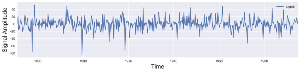
# Plot the original signal
def plot_signal(time, signal, figname=None):
fig, ax = plt.subplots(figsize=(15, 3))
ax.plot(time, signal, label='signal')
ax.set_xlim([time[0], time[-1]])
ax.set_ylabel('Amplitude', fontsize=18)
ax.set_xlabel('Time', fontsize=18)
ax.legend()
plt.savefig(figname if figname else 'signal_plot.png', dpi=300, bbox_inches='tight')
plt.close()
plot_signal(time, signal)
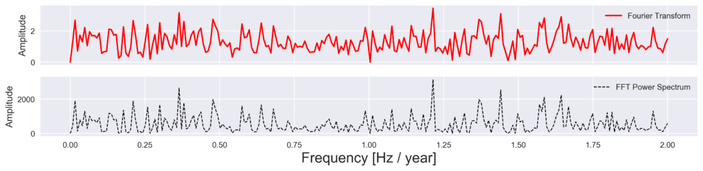
Next, we apply Fourier Transform to the signal to compare the time-invariant frequency spectrum.
def get_fft_values(y_values, T, N, f_s):
    f_values = np.linspace(0.0, 1.0/(2.0*T), N//2)
    fft_values_ = np.fft.fft(y_values)
    fft_values = 2.0/N * np.abs(fft_values_[0:N//2])
    return f_values, fft_values

def plot_fft_plus_power(time, signal, figname=None):
    dt = time[1] - time[0]
    N = len(signal)
    fs = 1/dt
    f_values, fft_values = get_fft_values(signal, dt, N, fs)

    fig, ax = plt.subplots(2, 1, figsize=(15, 3))
    ax[0].plot(f_values, fft_values, label='Fourier Transform', color='r')
    ax[1].plot(f_values, fft_values**2, label='FFT Power Spectrum', color='k')
    ax[1].set_xlabel('Frequency [Hz]', fontsize=18)
    ax[1].set_ylabel('Power', fontsize=18)
    plt.savefig(figname if figname else 'fft_plus_power.png', dpi=300, bbox_inches='tight')
    plt.close()

plot_fft_plus_power(time, signal)
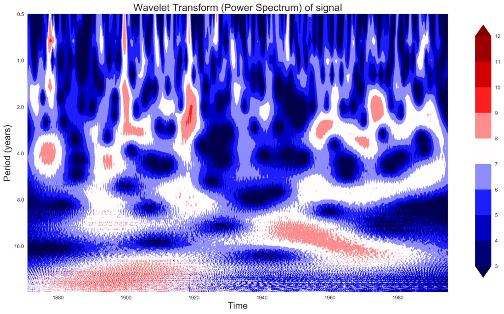
Finally, we use Wavelet Transform to visualize time-frequency localization.
def plot_wavelet(time, signal, scales, waveletname='cmor1.5-1.0', cmap=plt.cm.seismic, figname=None):
    dt = time[1] - time[0]
    coefficients, frequencies = pywt.cwt(signal, scales, waveletname, dt)
    power = np.abs(coefficients)**2
    period = 1. / frequencies

    fig, ax = plt.subplots(figsize=(15, 10))
    im = ax.contourf(time, np.log2(period), np.log2(power), cmap=cmap)
    ax.set_title('Wavelet Transform (Power Spectrum)', fontsize=20)
    ax.set_xlabel('Time', fontsize=18)
    ax.set_ylabel('Period (years)', fontsize=18)
    plt.colorbar(im, ax=ax)
    plt.savefig(figname if figname else f'wavelet_{waveletname}.png', dpi=300, bbox_inches='tight')
    plt.close()

plot_wavelet(time, signal, scales)
Final Observations
For the ENSO dataset, the analysis reveals significant power concentration in the 2–8 year period range, particularly before 1920. The power decreases thereafter, with the wavelet spectrogram showing a transition to shorter periods as time progresses.
In the Indian monsoon rainfall dataset, the power is more evenly distributed across periods but exhibits a similar shift to shorter periods over time. The Wavelet Transform effectively highlights these time-varying features that remain obscured in the Fourier Transform.
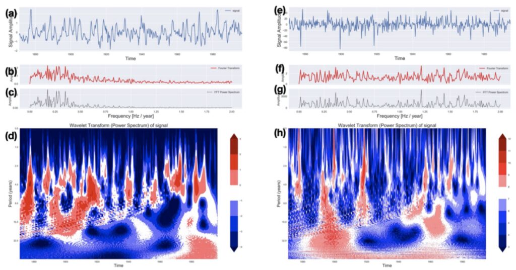
(a) and (e) shows the time series in °C and mm, respectively for ENSO and Indian monsoon. (b) and (f) shows the Fourier Transform, (c) and (g) shows the Power spectrum of ENSO and Indian monsoon respectively.
Please cite this work if you use this code:
[zotpress items=”{9687752:ZD3THVWQ}” style=”apa”]
References
[zotpress items=”{9687752:ZD3THVWQ},{9687752:93GETI4Y},{9687752:QZ7A3W8C},{9687752:VQ29U4S9},{9687752:6KXHMCTK}” style=”apa”]